DE VELINX
26/27
We shine a light on what moves you
For this cultural season, light takes the lead.
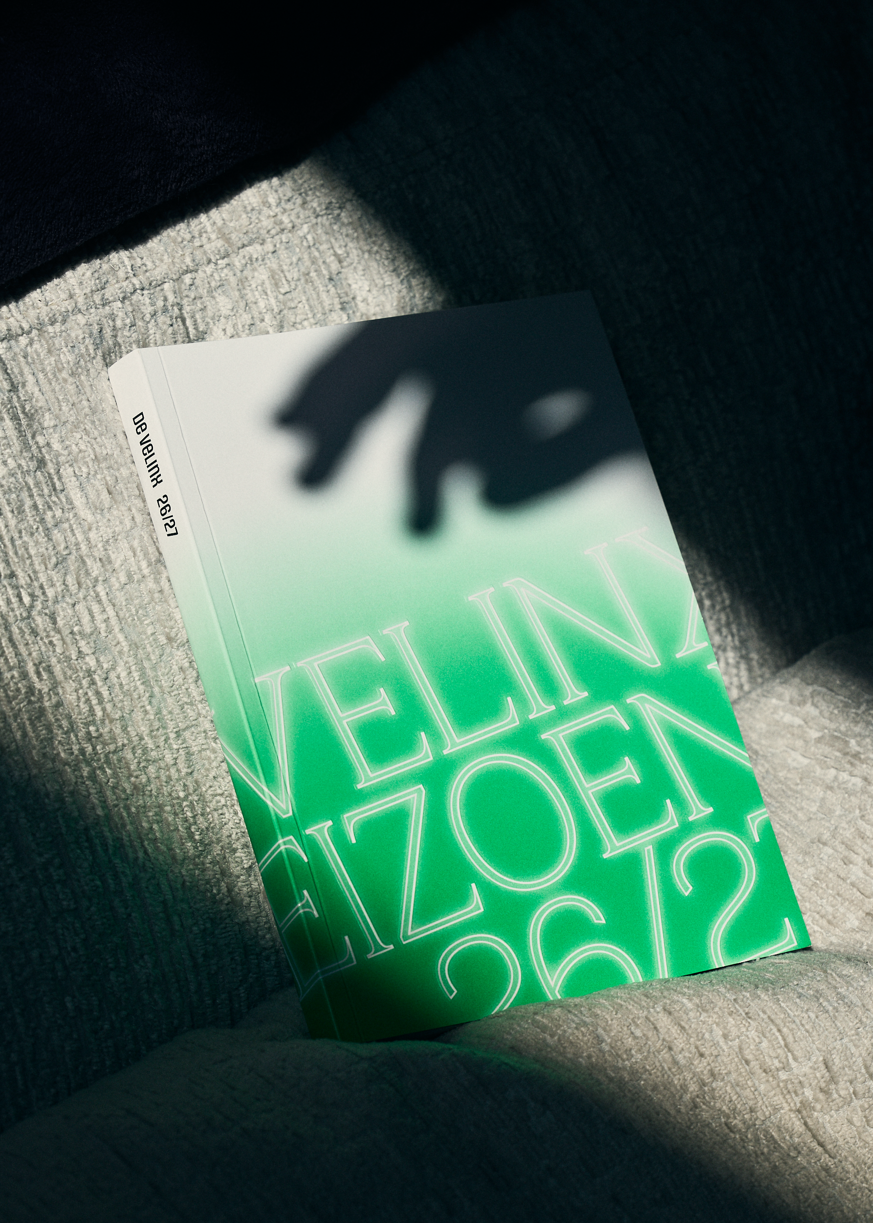
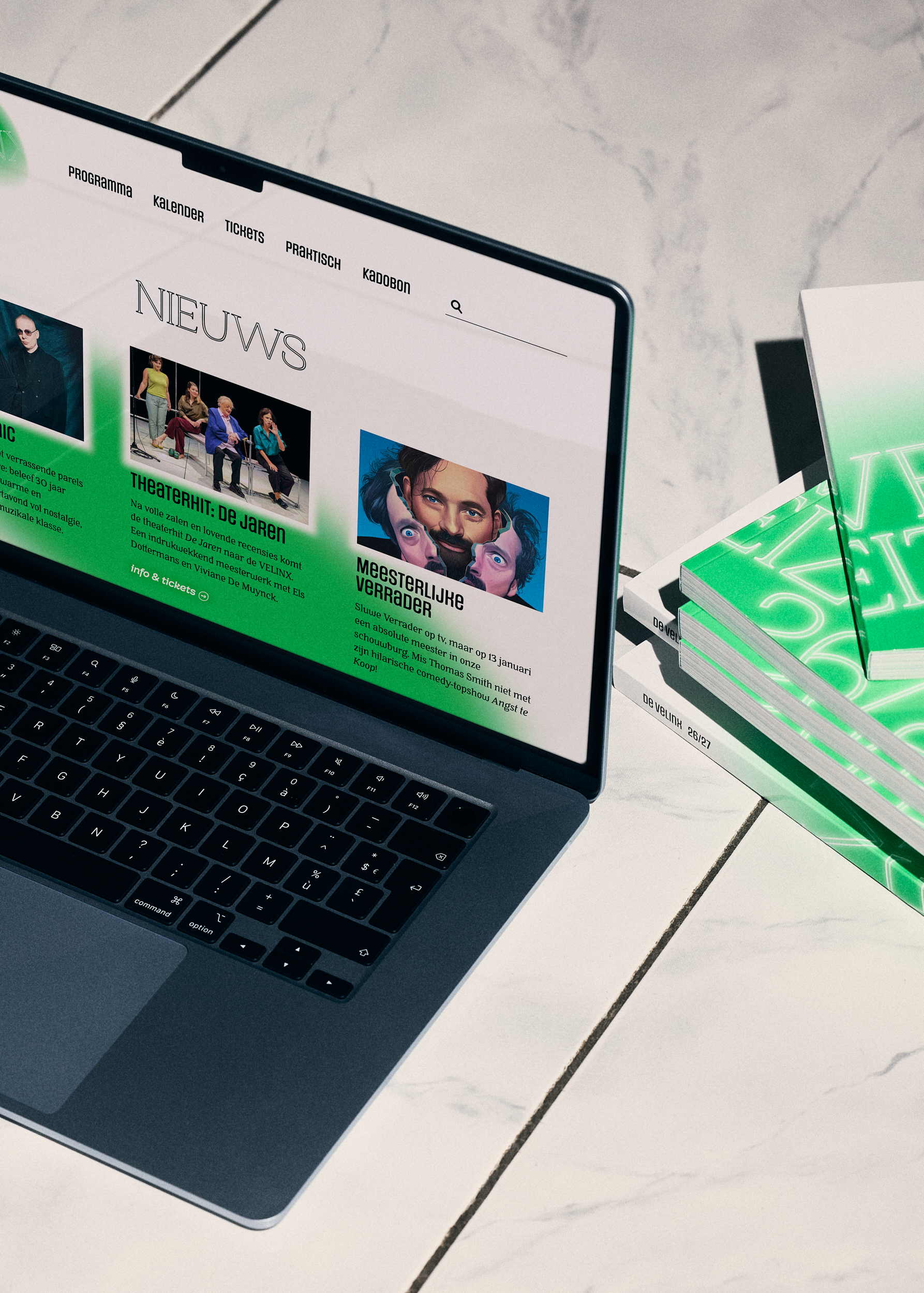
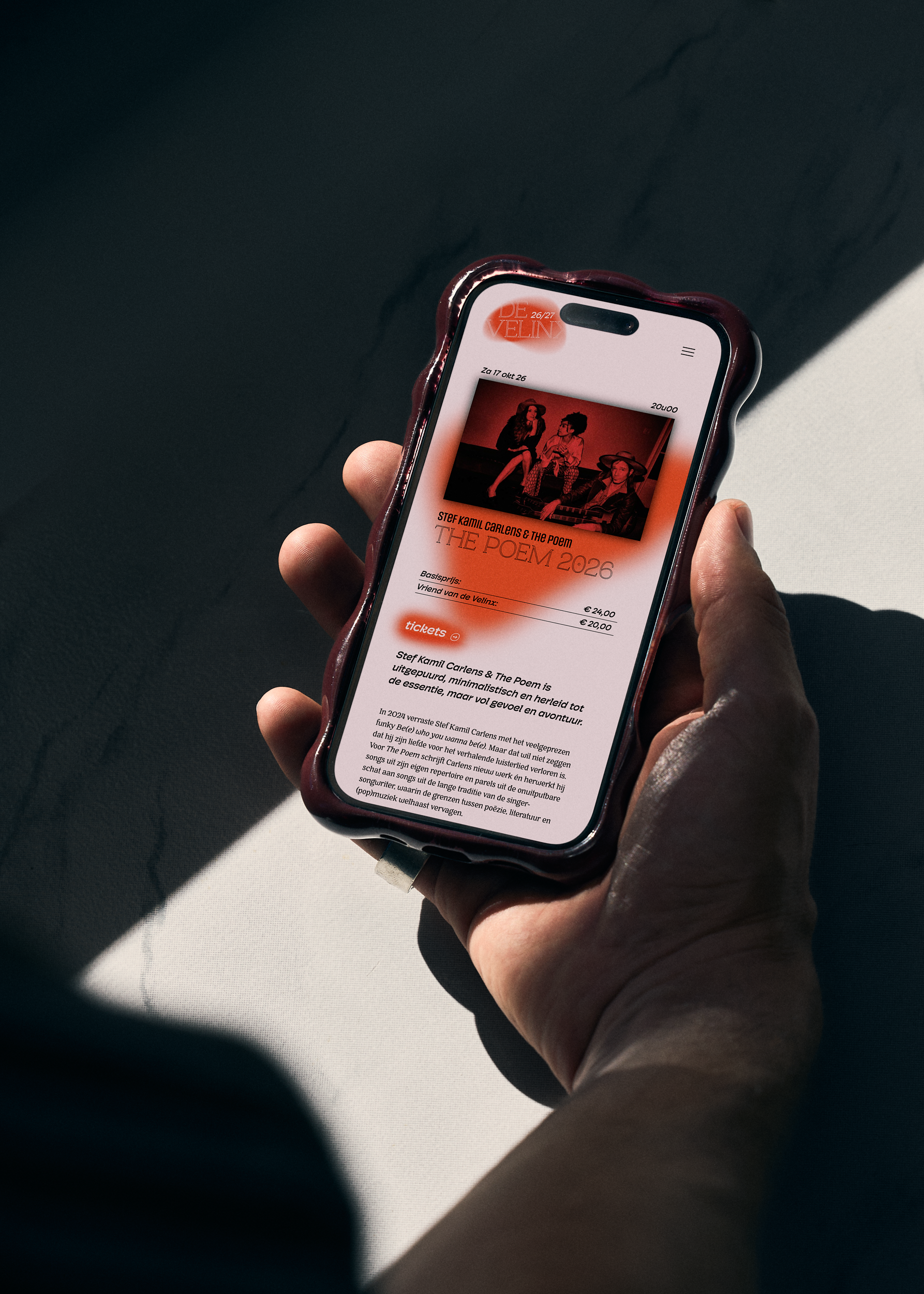
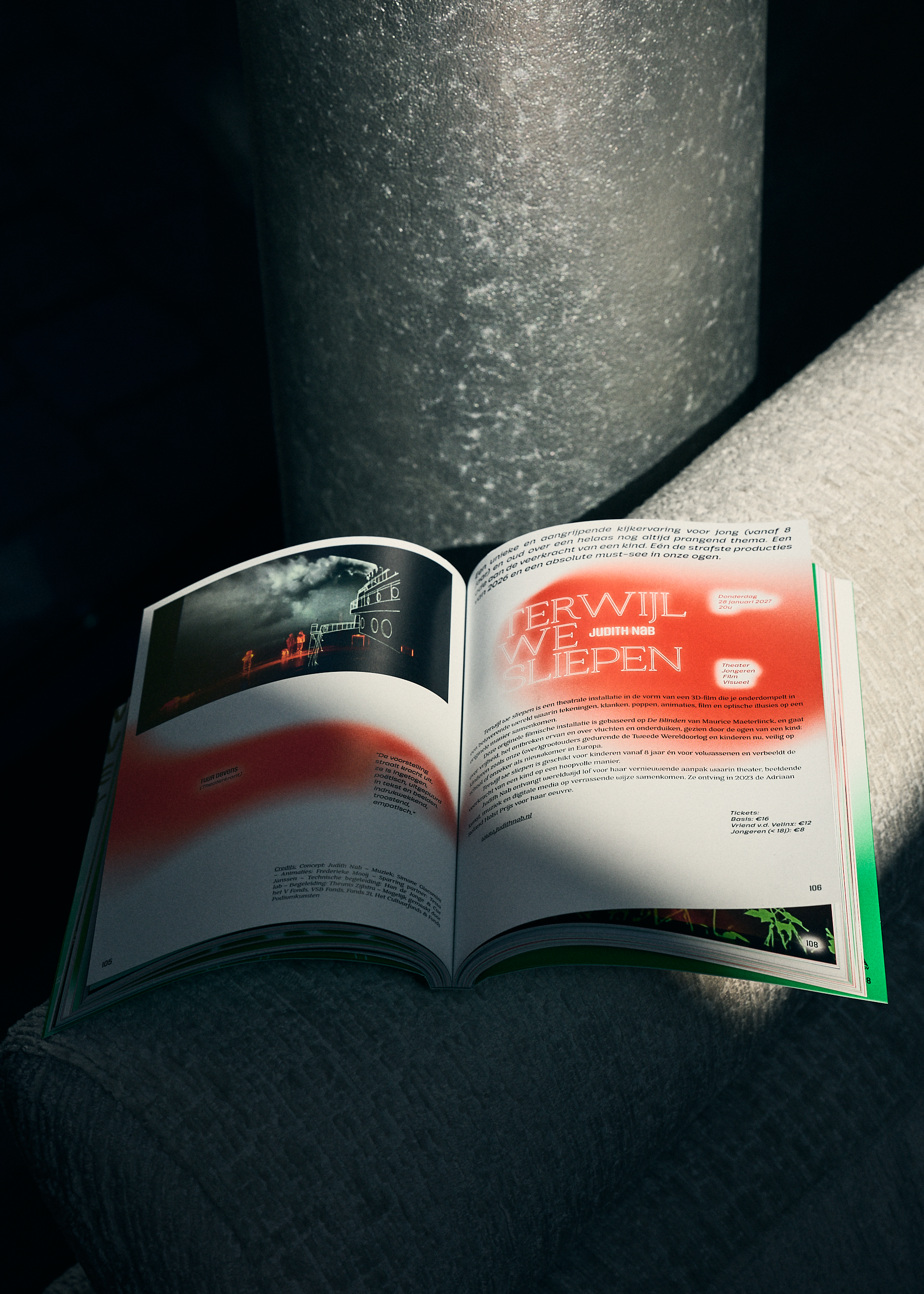
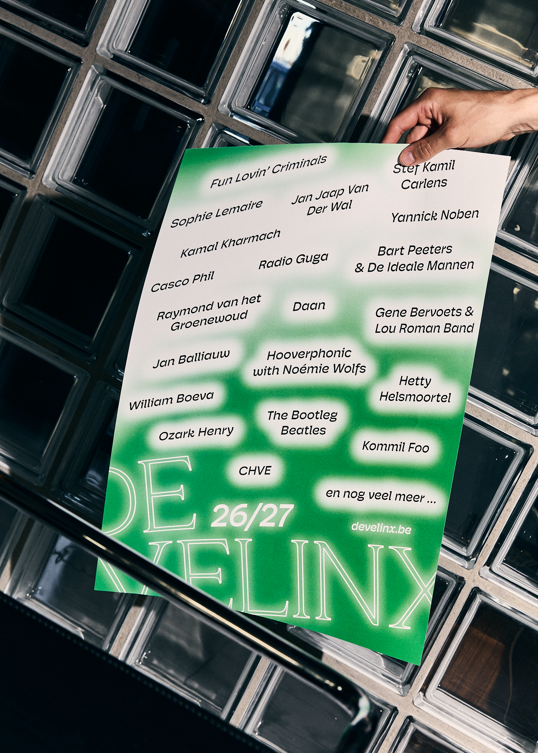
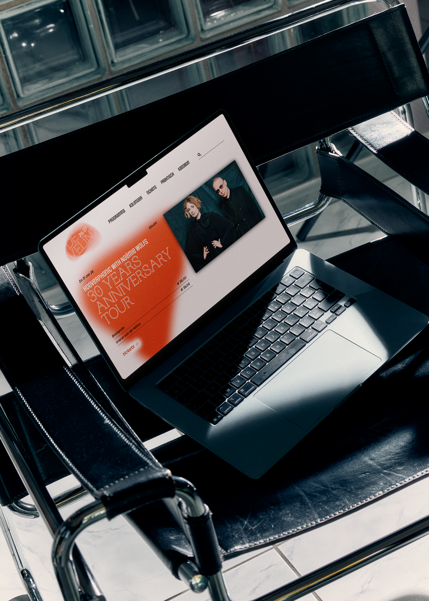
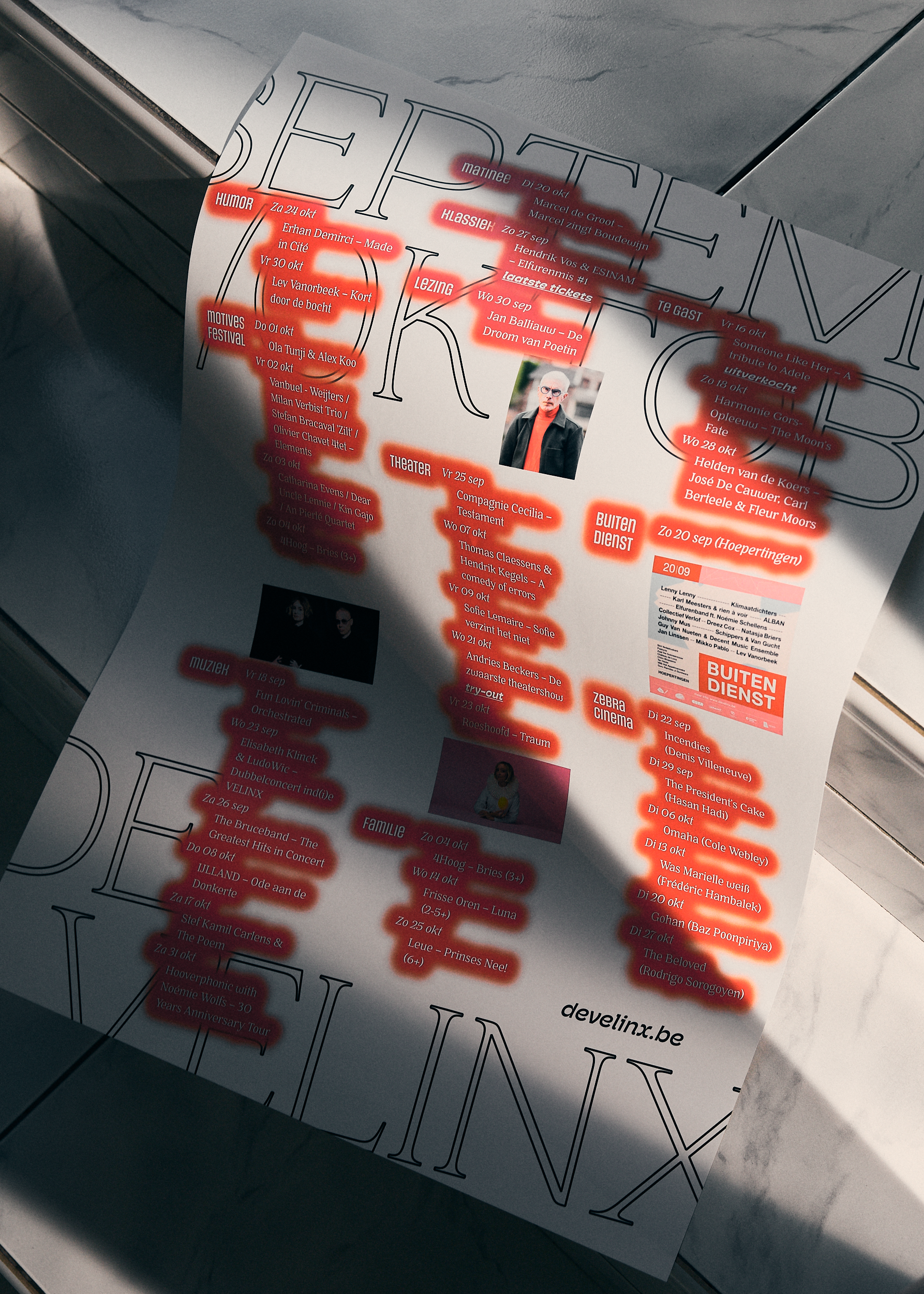
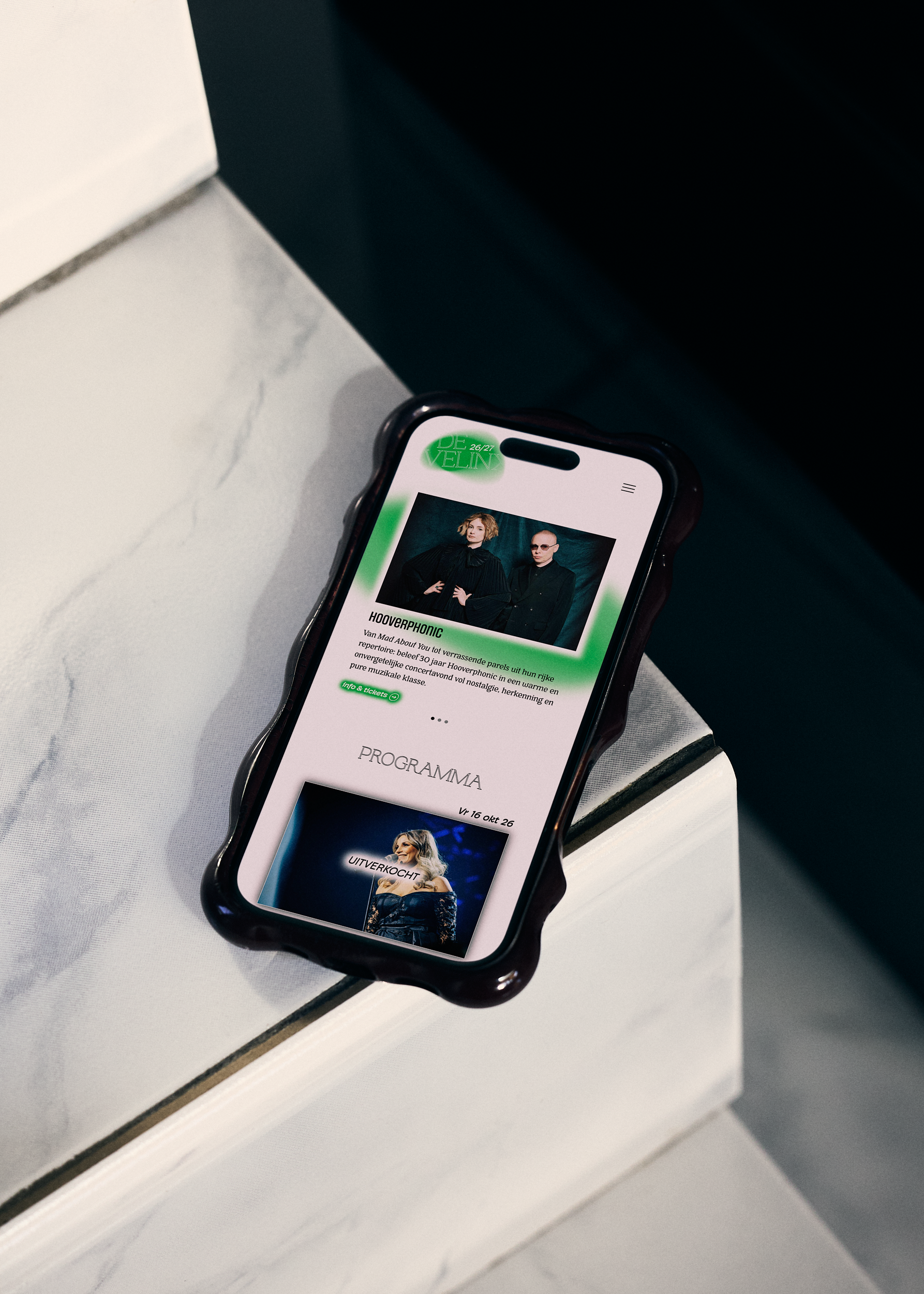
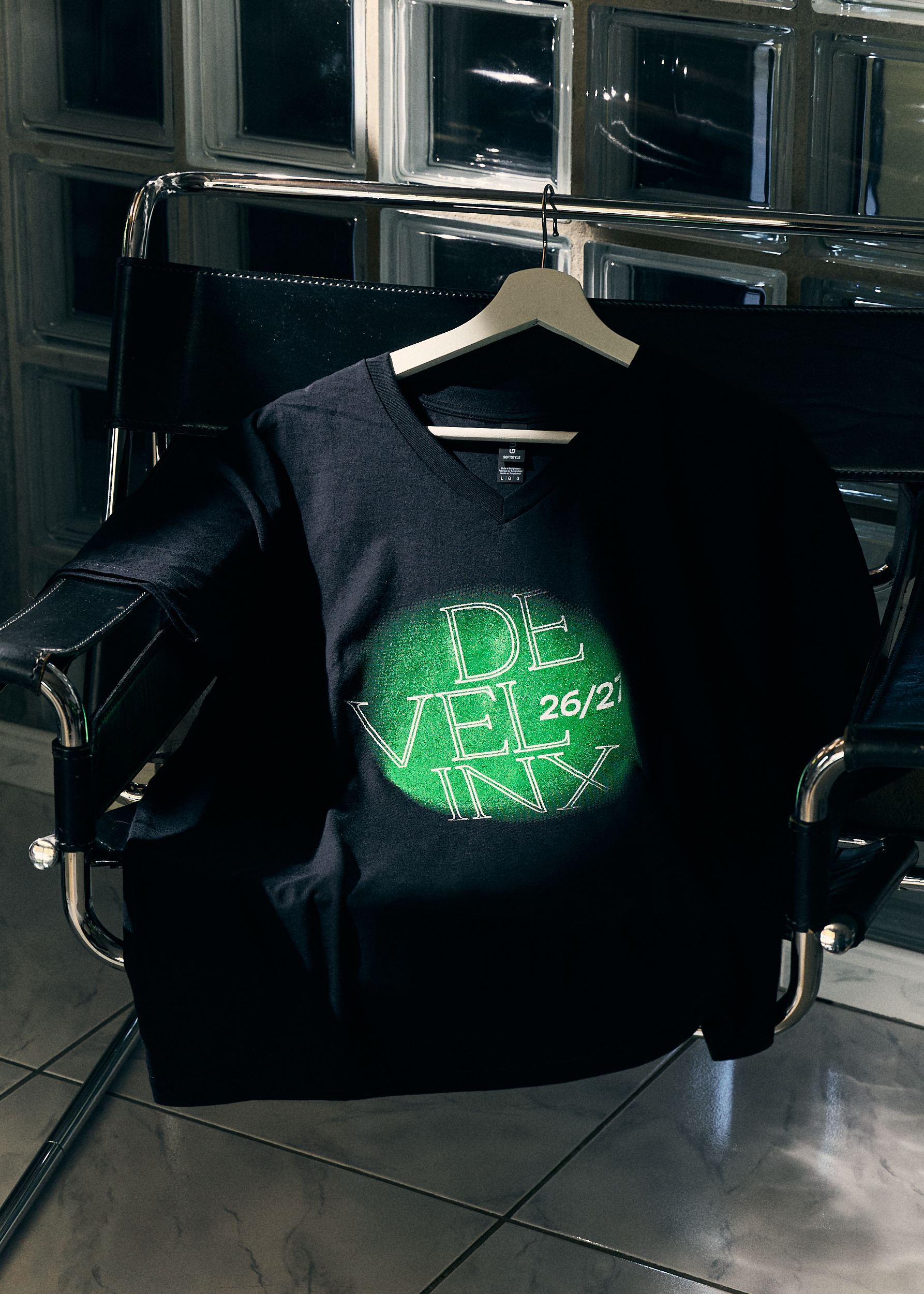
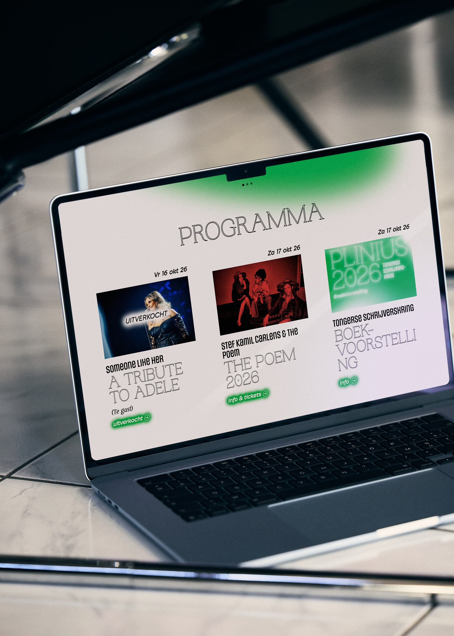
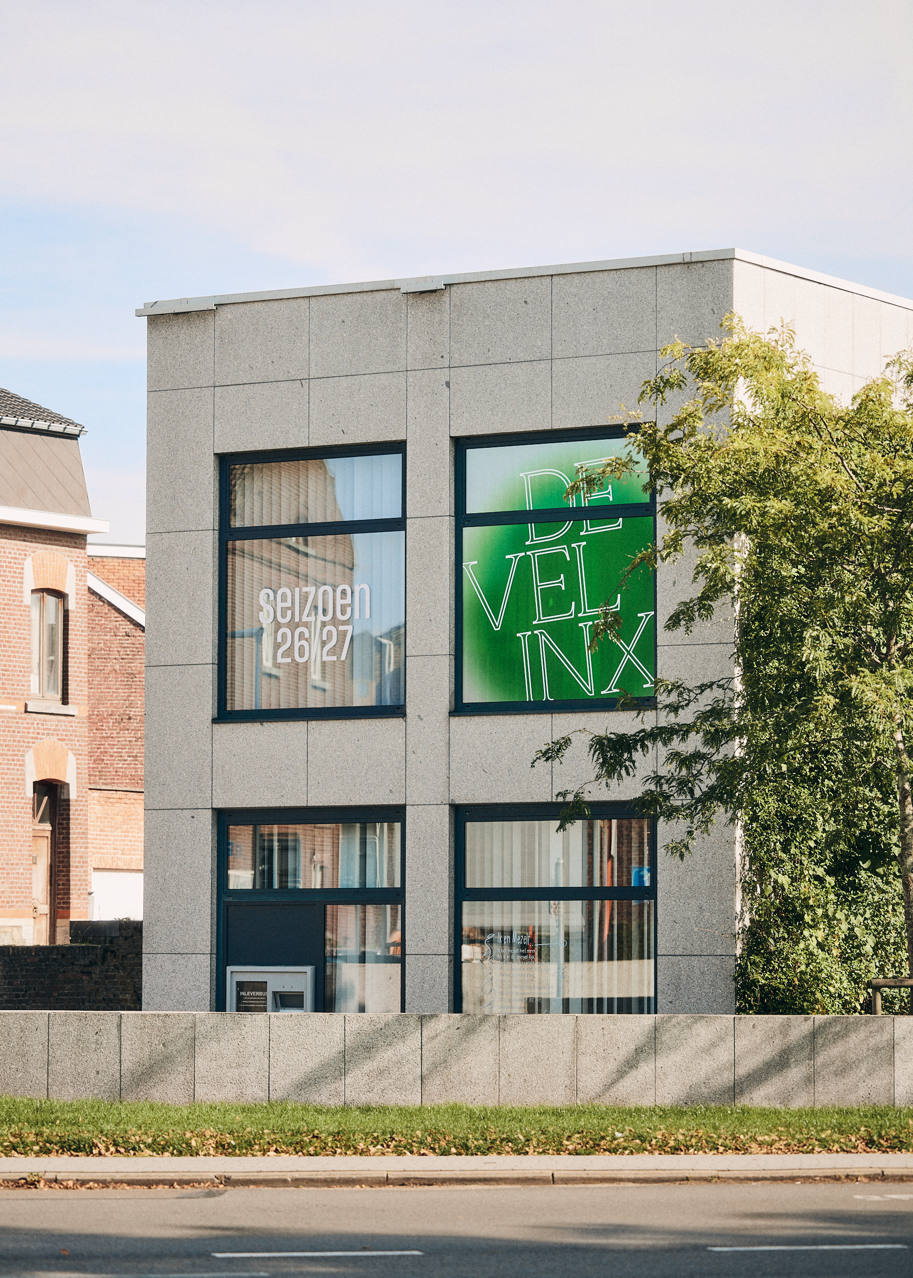
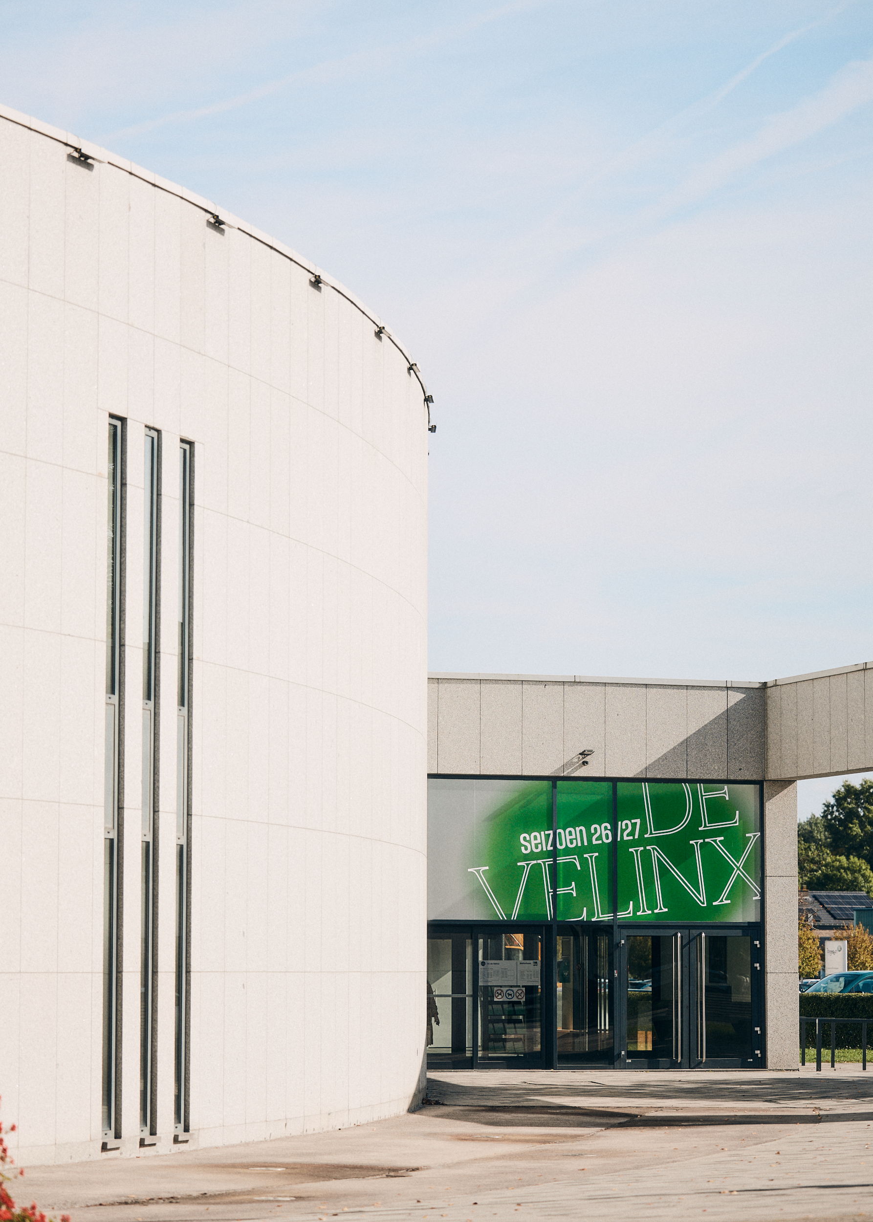
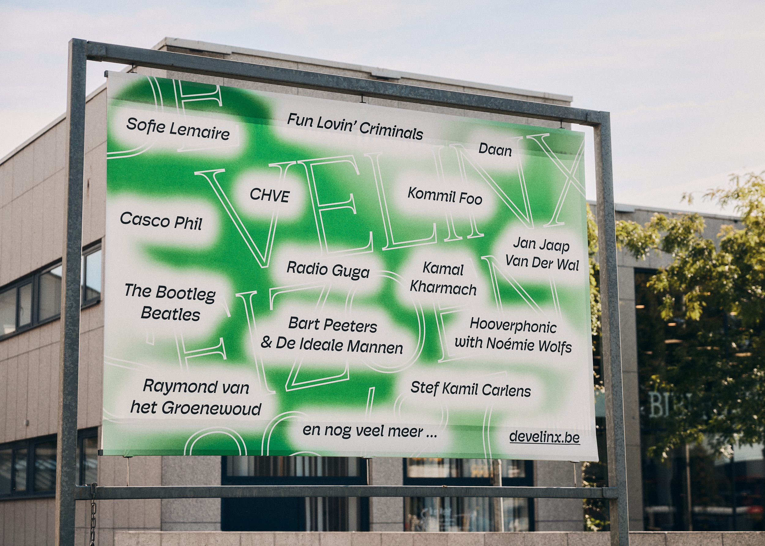
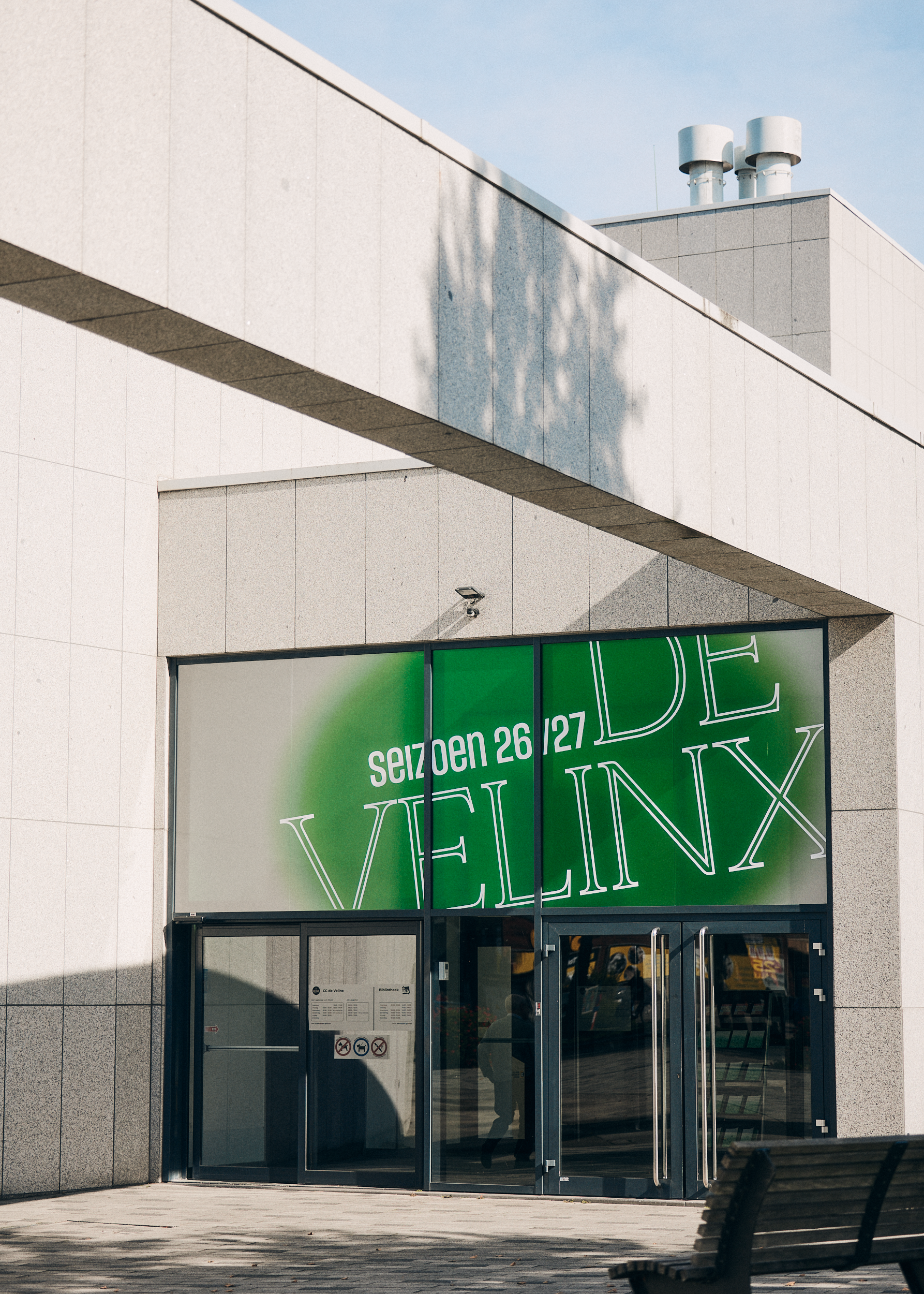
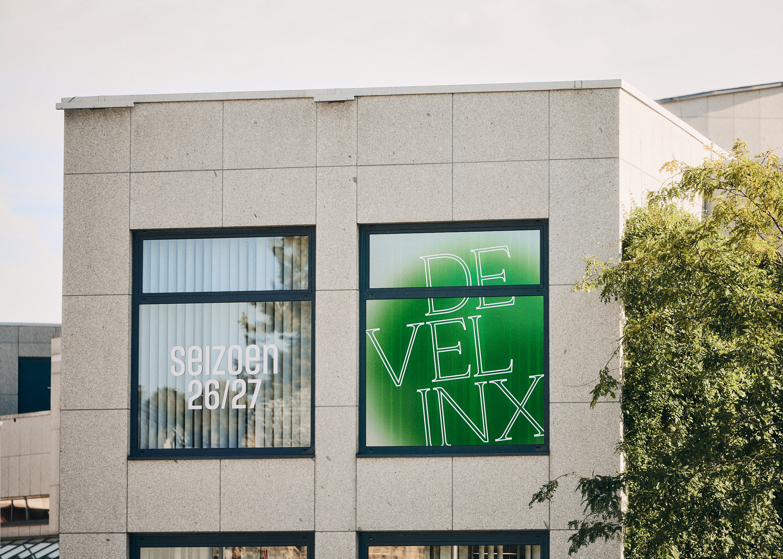
The idea starts with De Velinx itself: shining a light on artists, stories and performances that move people. We built the entire art direction around that idea and translated it to paper.
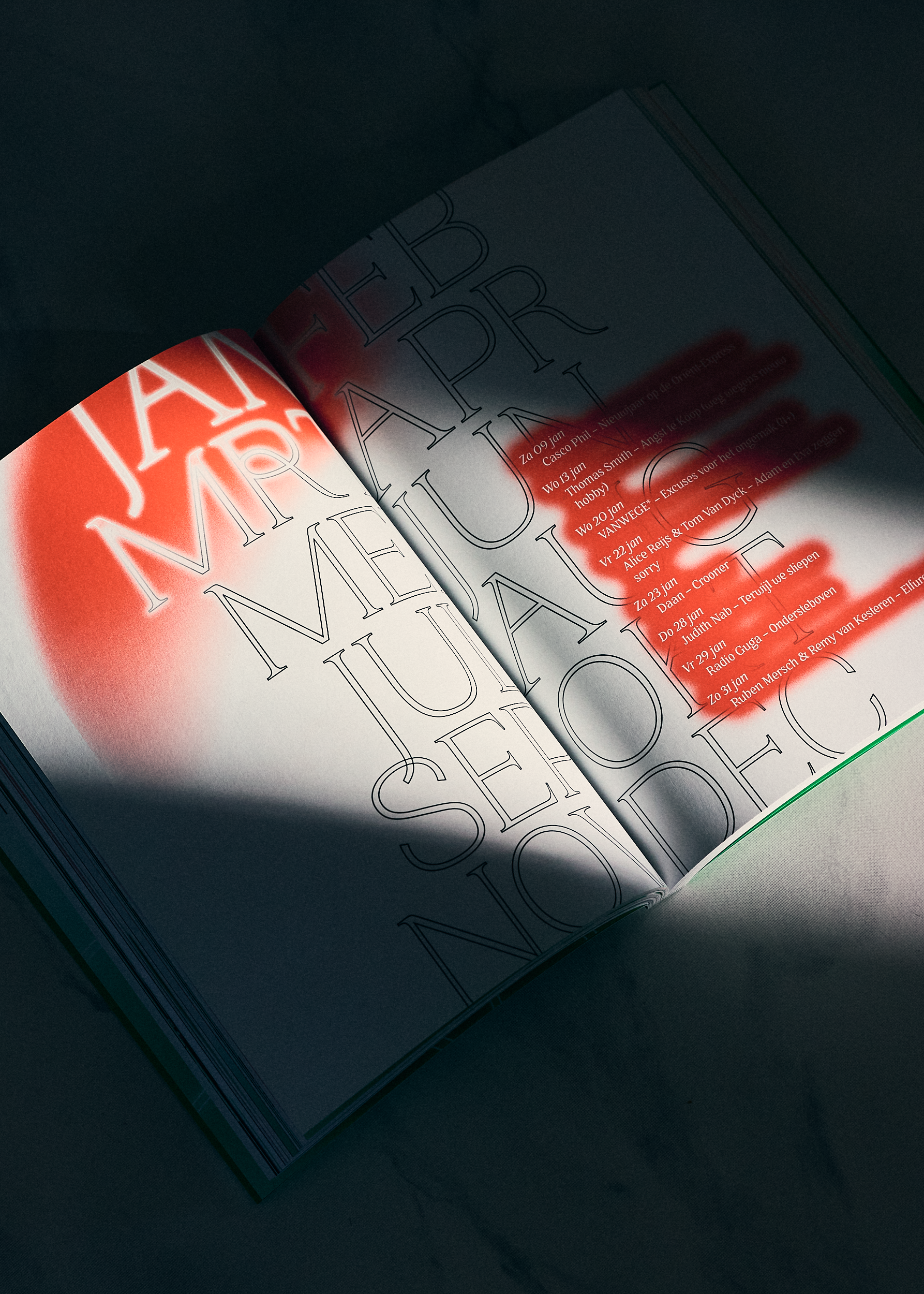
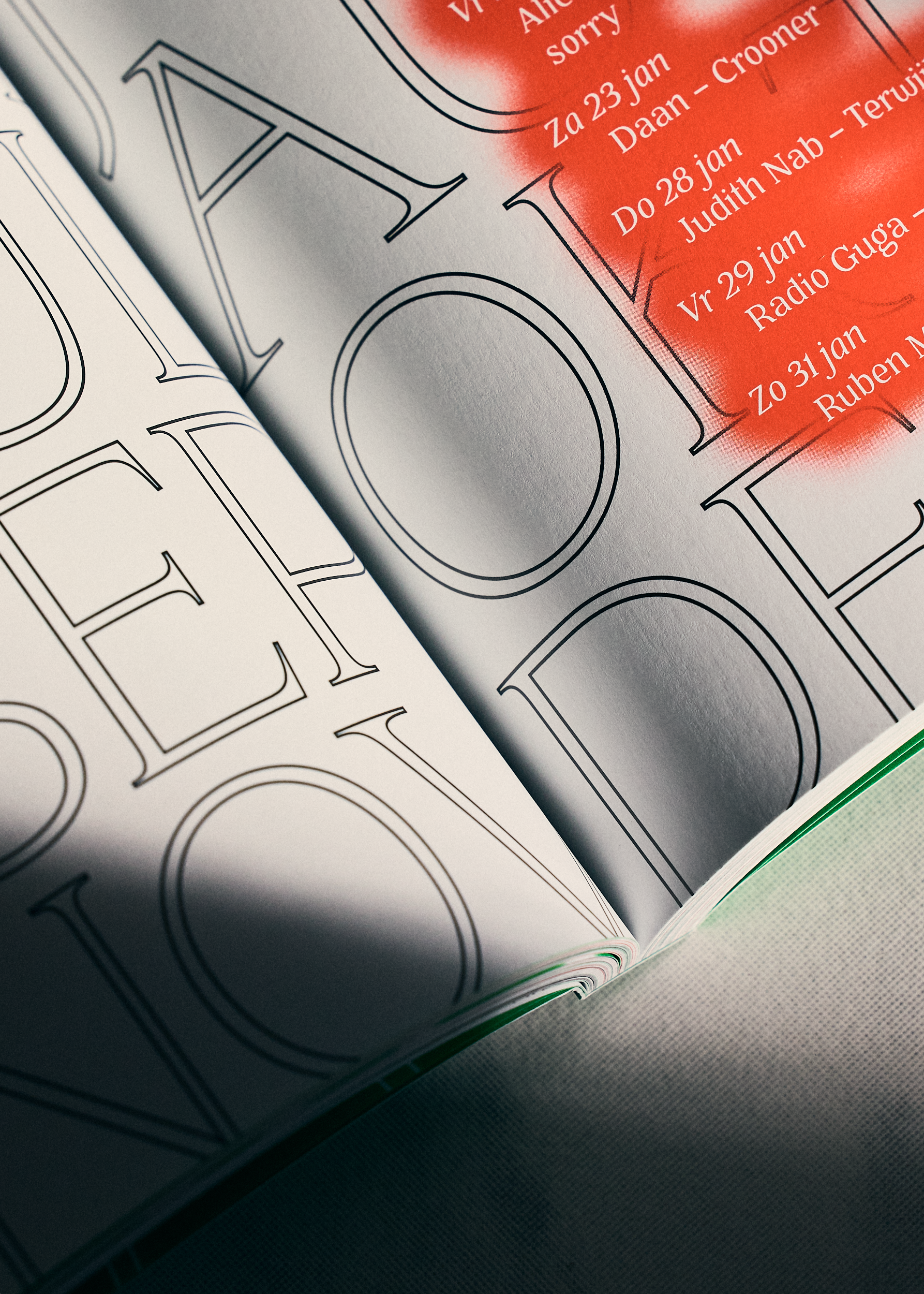
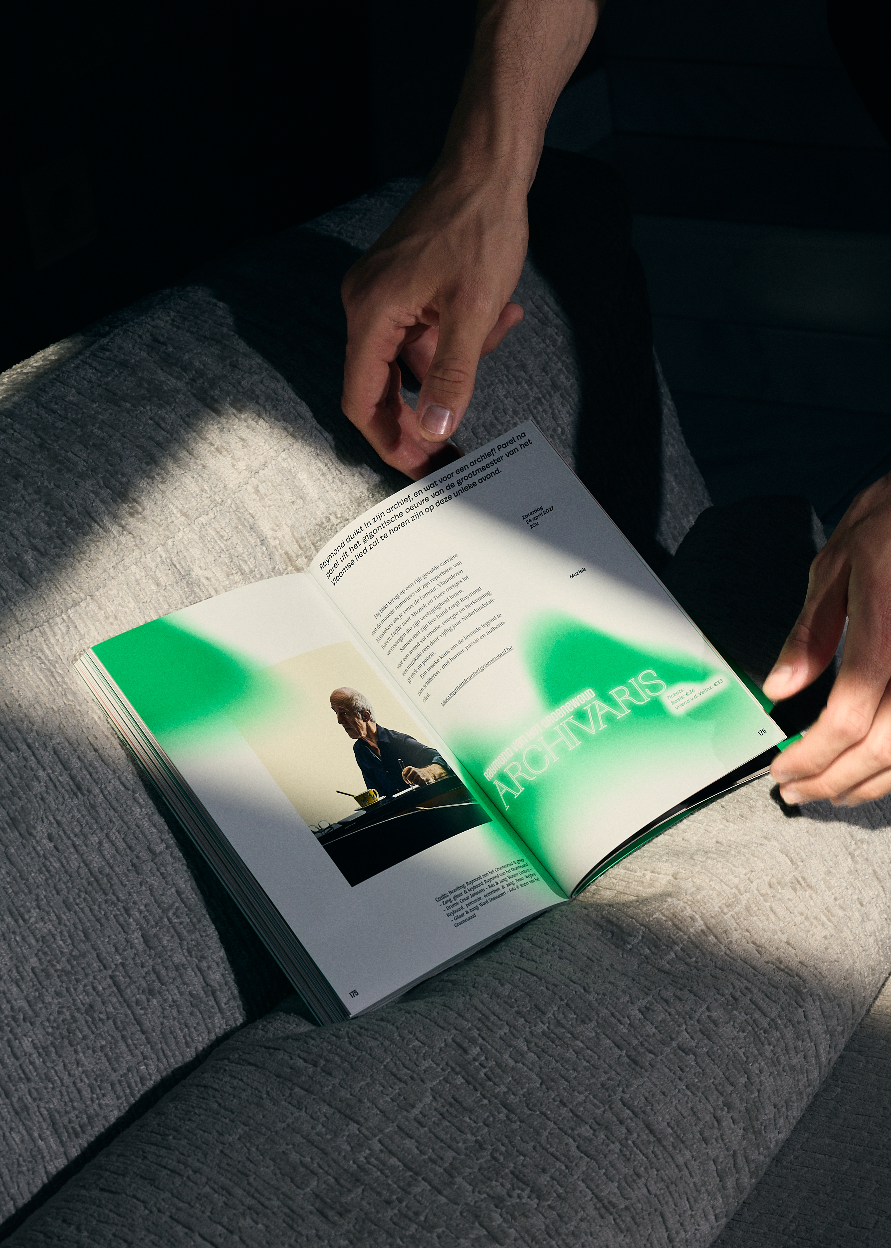
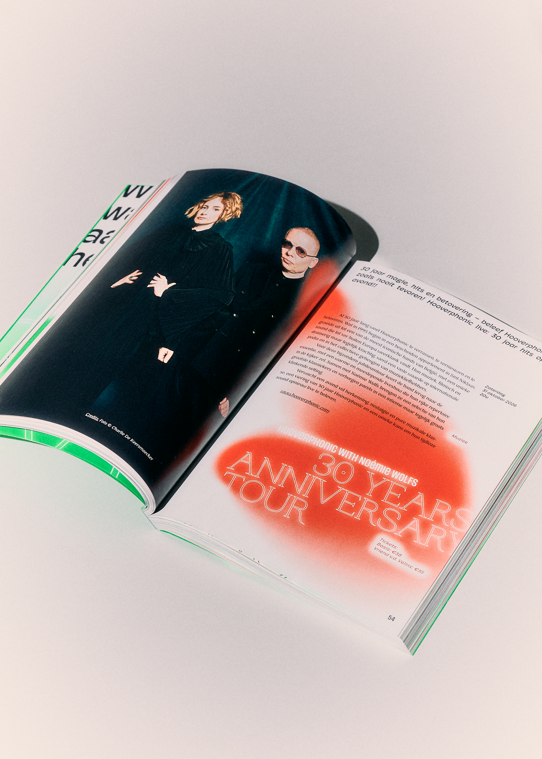
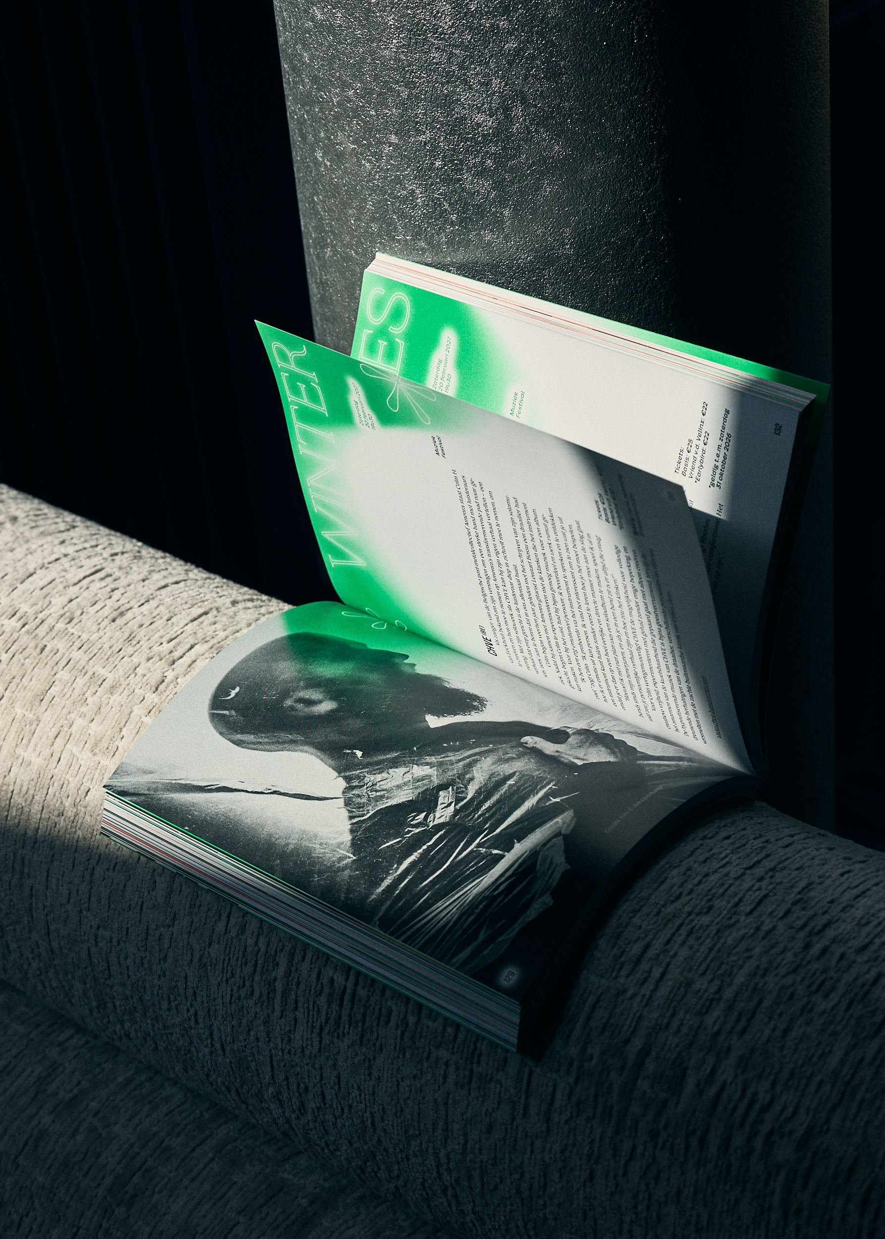
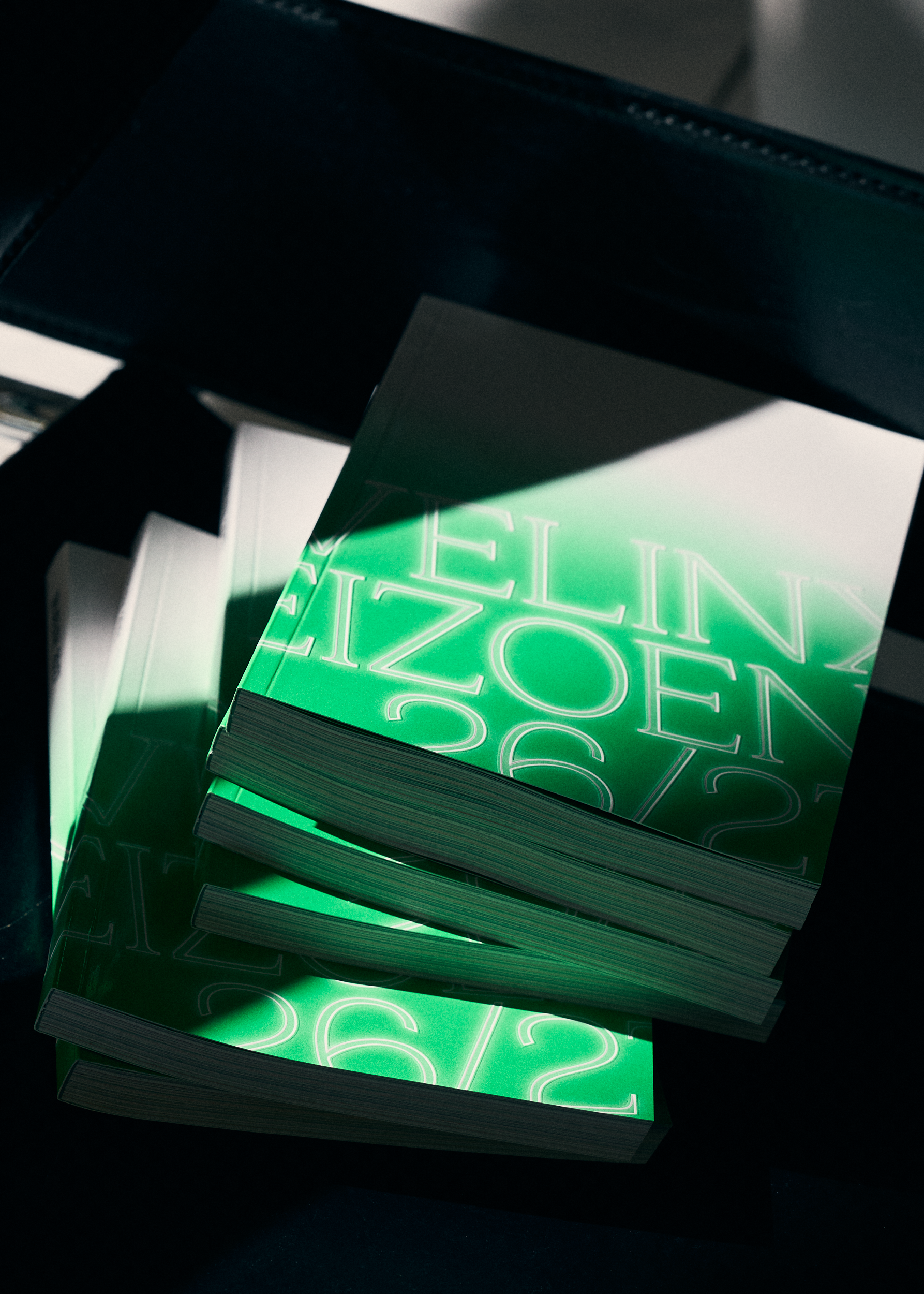
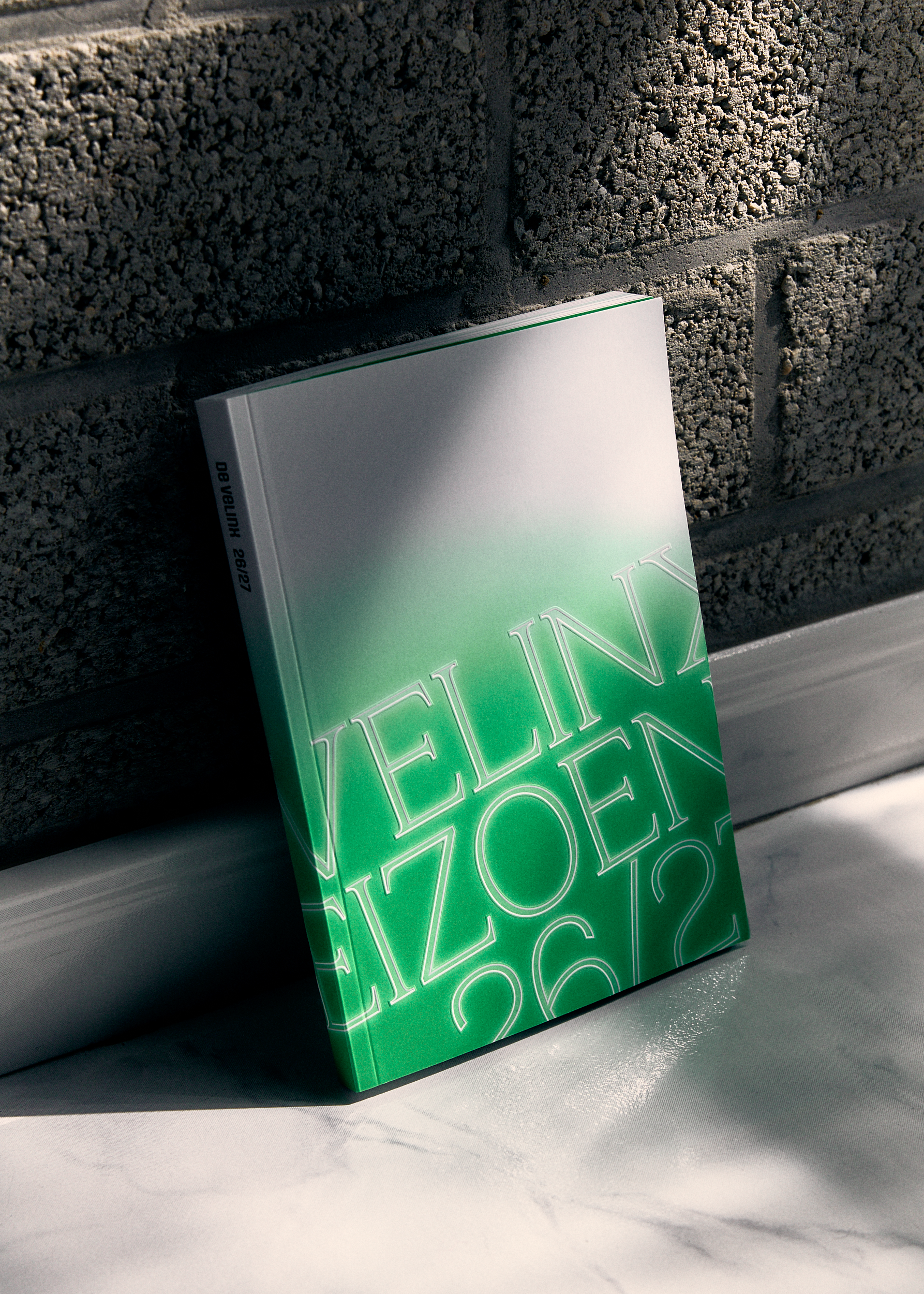
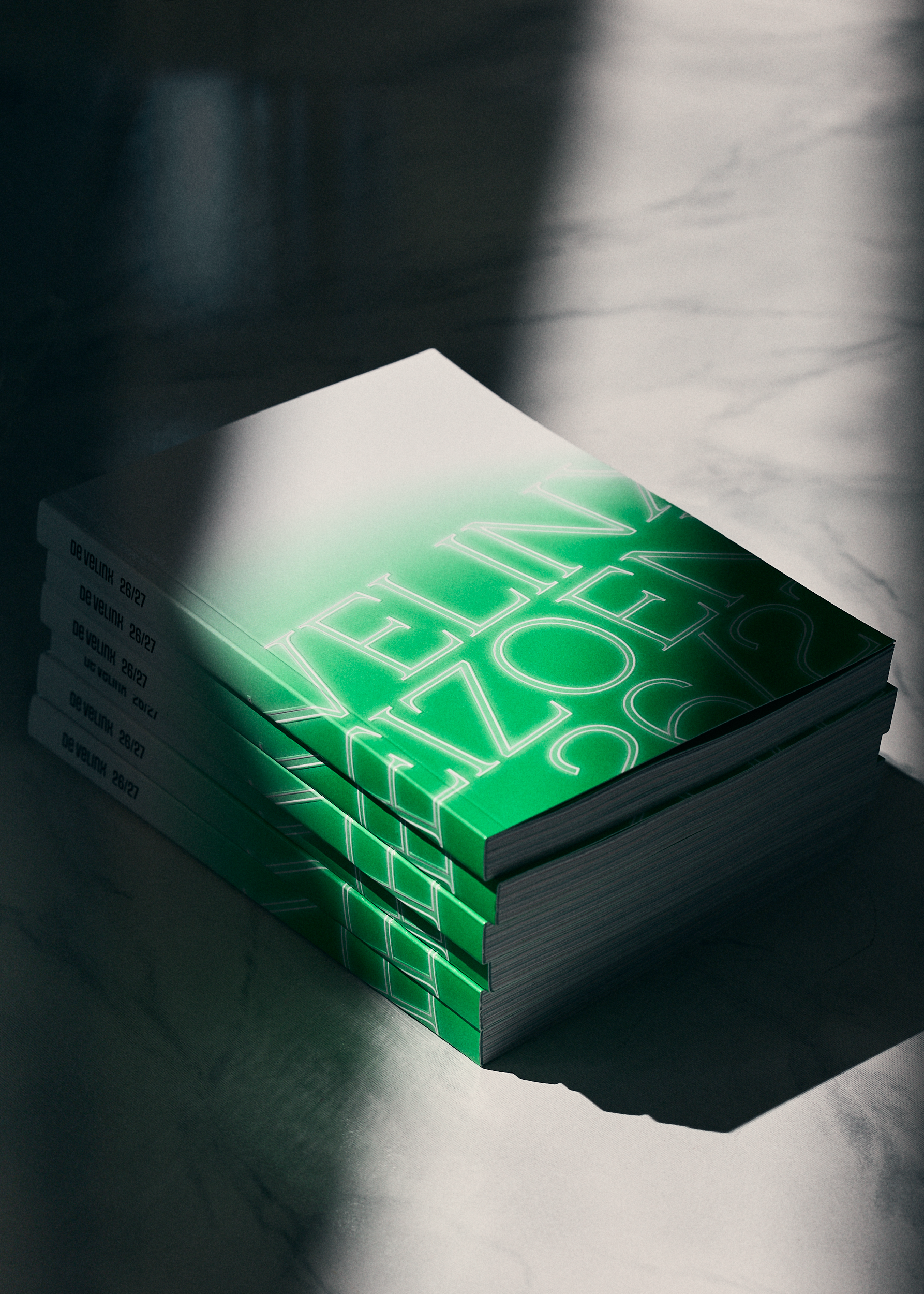
Big, bright patches of green and orange light spill across the brochure, revealing performance titles wherever they land. We let light do the revealing.
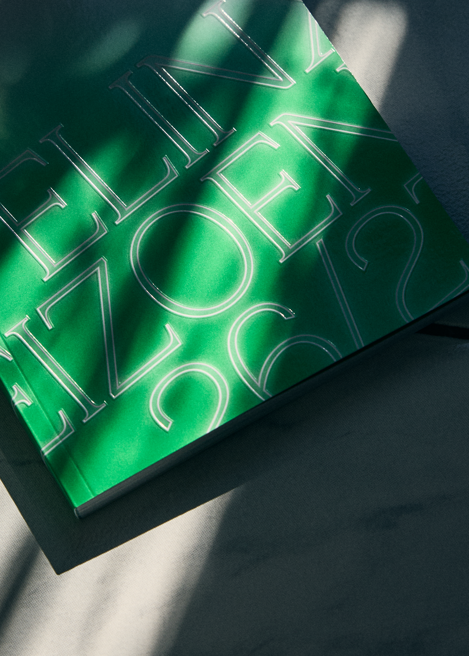
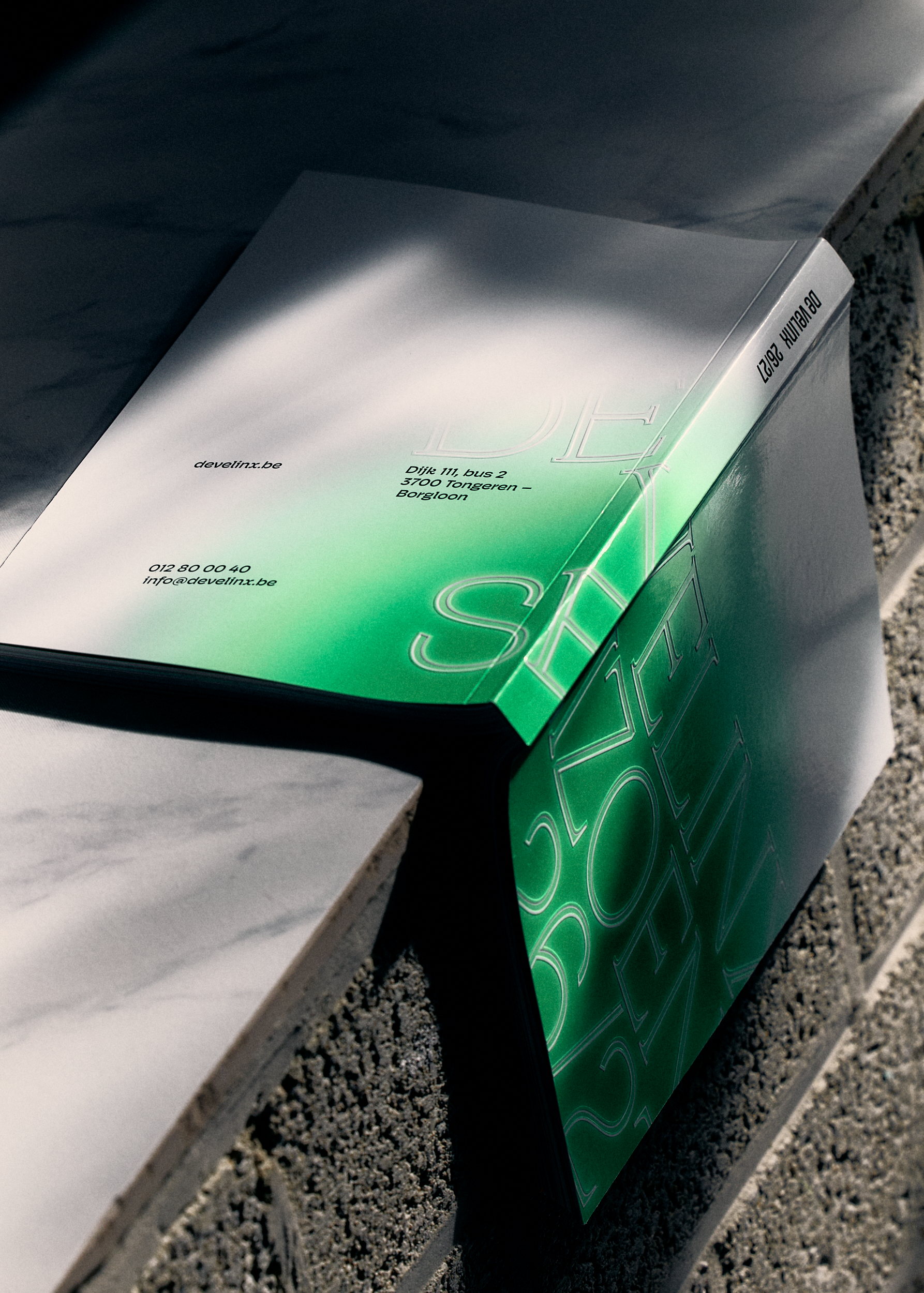
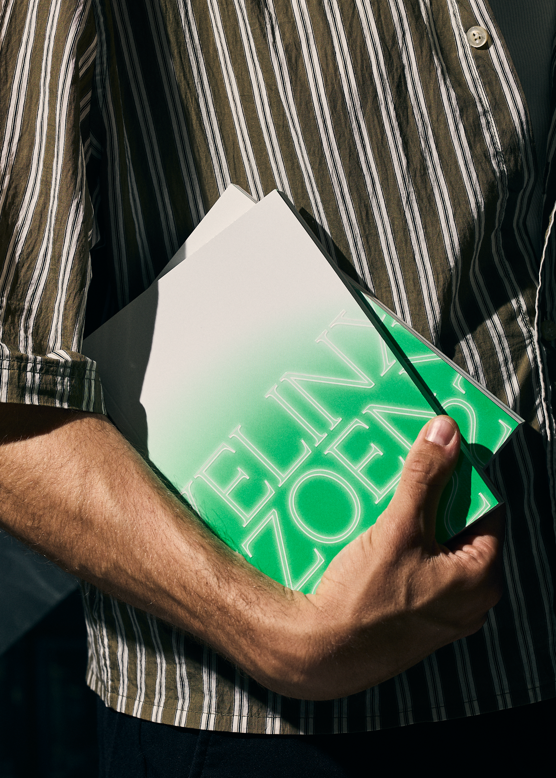
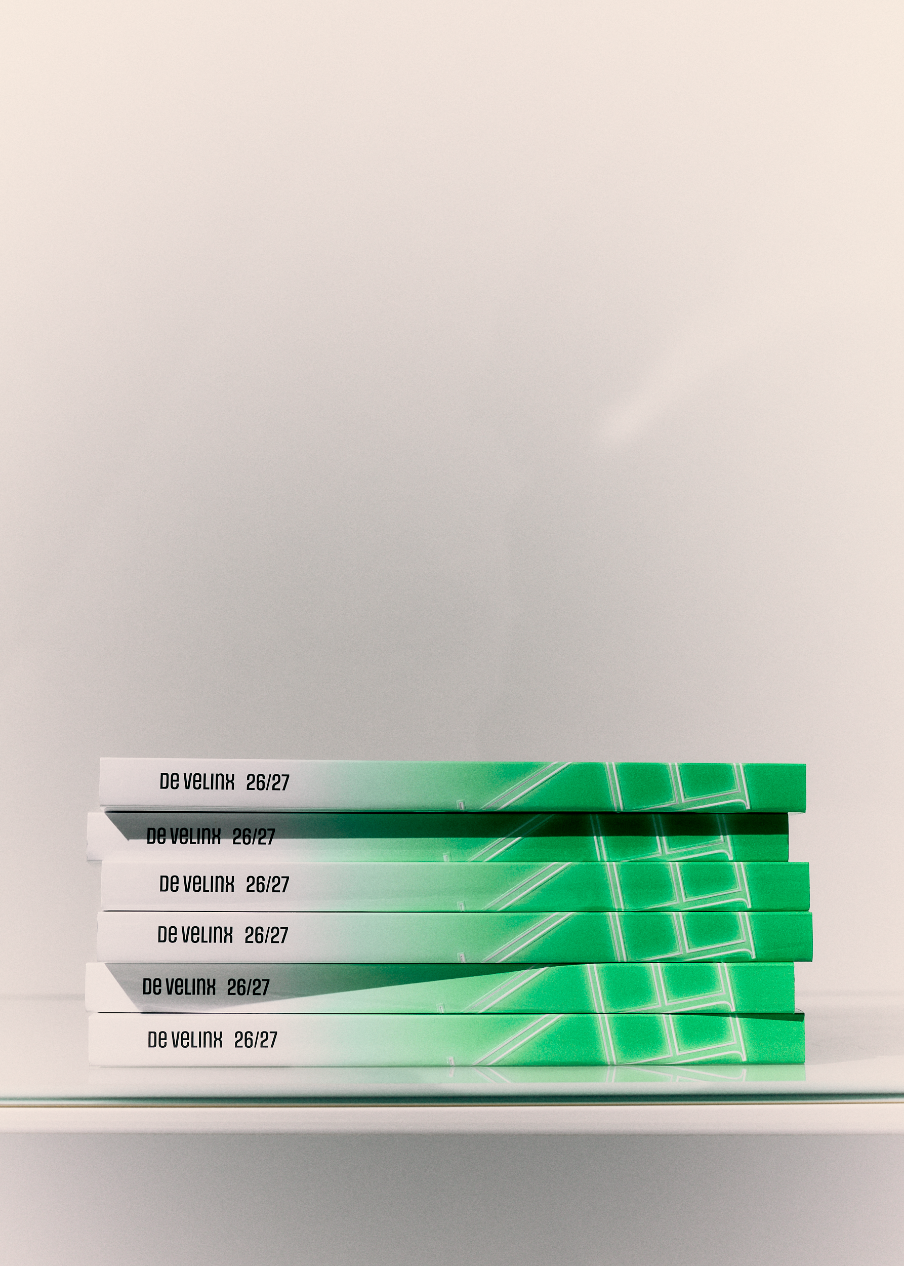
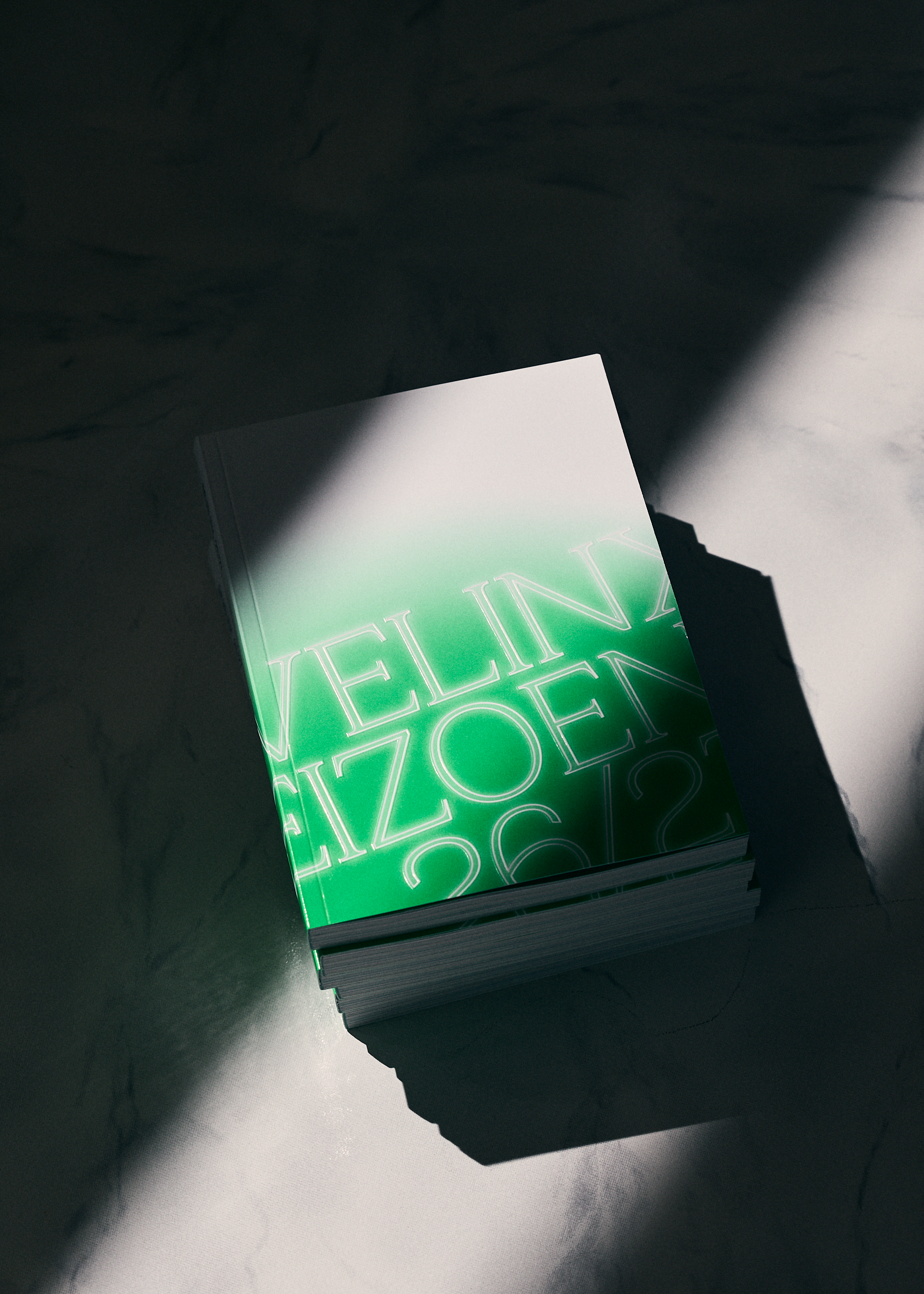
Two vivid Pantone colours give the light its intensity, enhanced by a subtle glow around the letters. Accompanied by beautiful embossing that follows the light all the way across the cover, wraps around the spine and quietly disappears on the back, exactly where the light ends.
A detail worth running your fingers over.
Details worthy of the spotlight.
Client: De Velinx / stad Tongeren
Photo: Gaëlle Spaas
Print: Haletra-Leën
Webdevelopment: Magix
Year: 2026
rebranding / logo design / brand identity / art-direction/ art-direction website / motion design / print / banners / print design / custom font / poster design / brochure / advertisement / merchandise / t-shirt