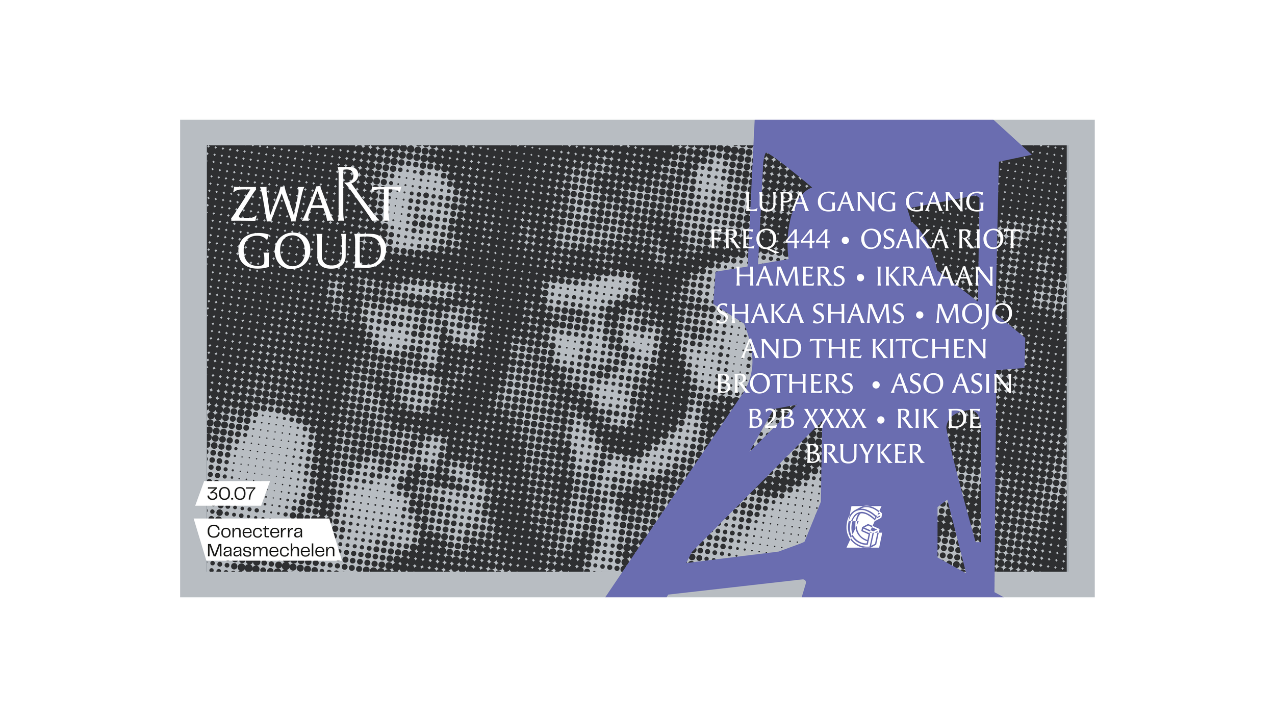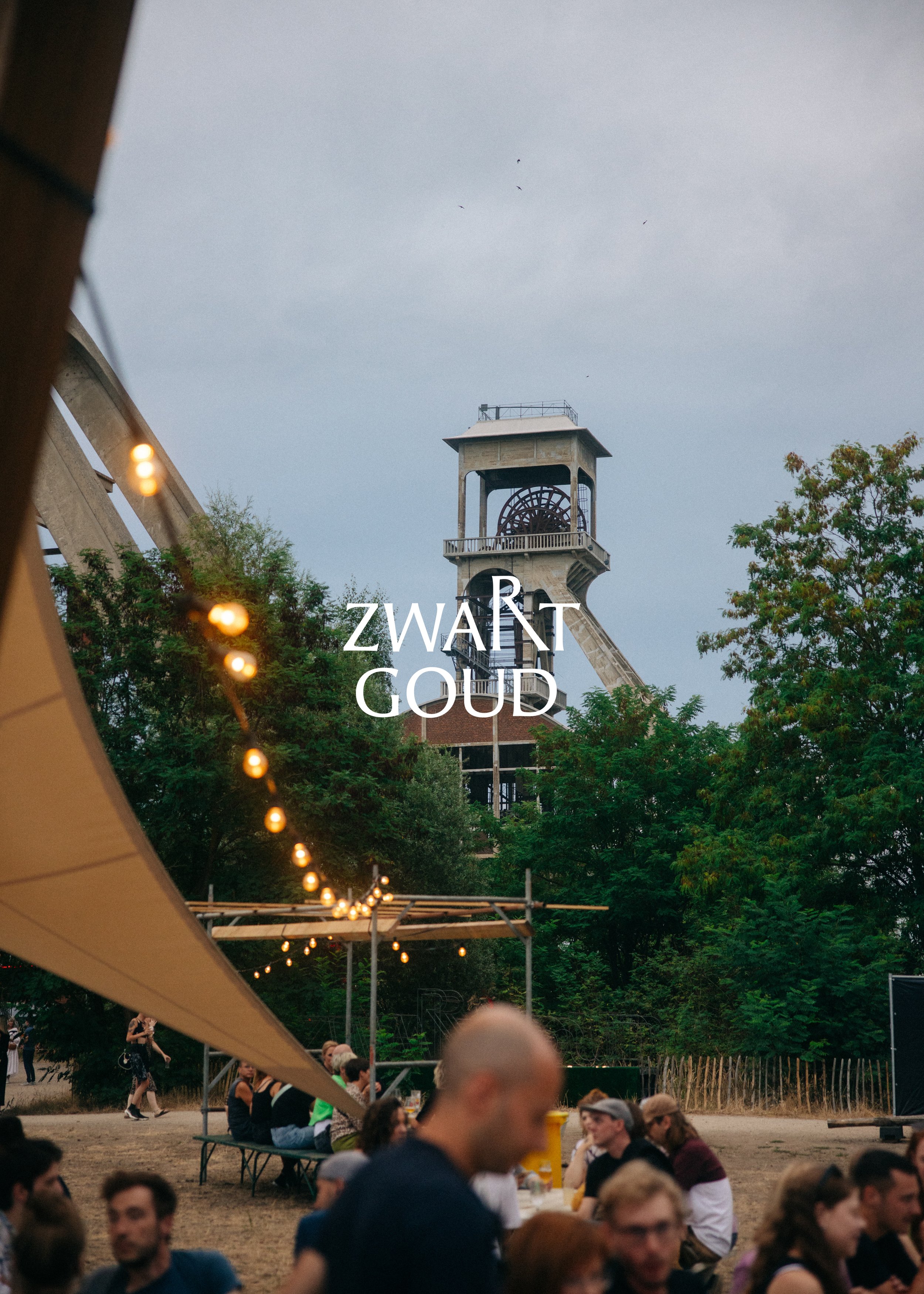
ZWART
GOUD
Rebranding for free alternative music festival Zwart Goud .
After a couple of successful years it was time to take things to the next level. A professional visual identity that perfectly reflects the festival’s vision and resonates with it’s target audience.
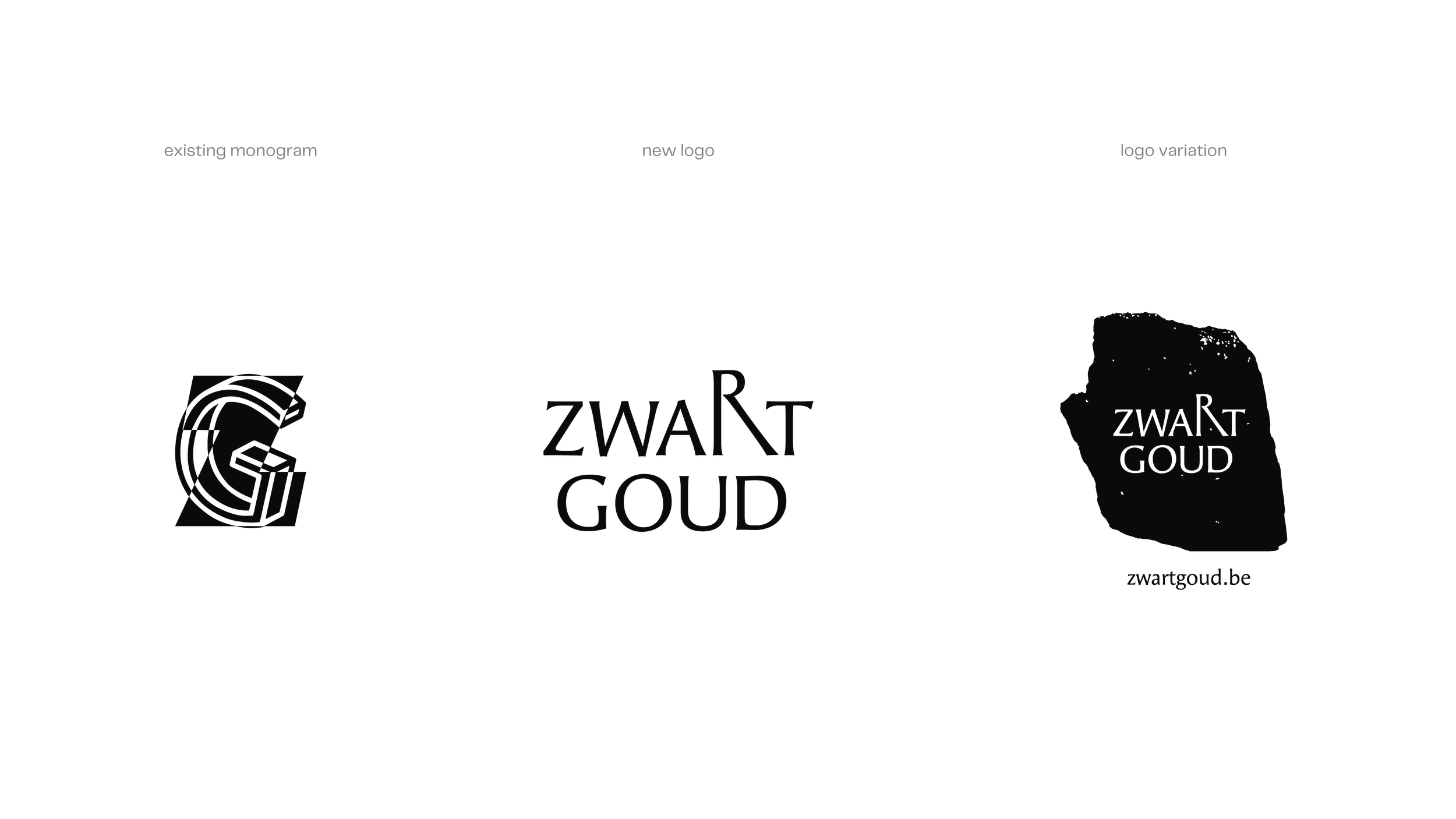
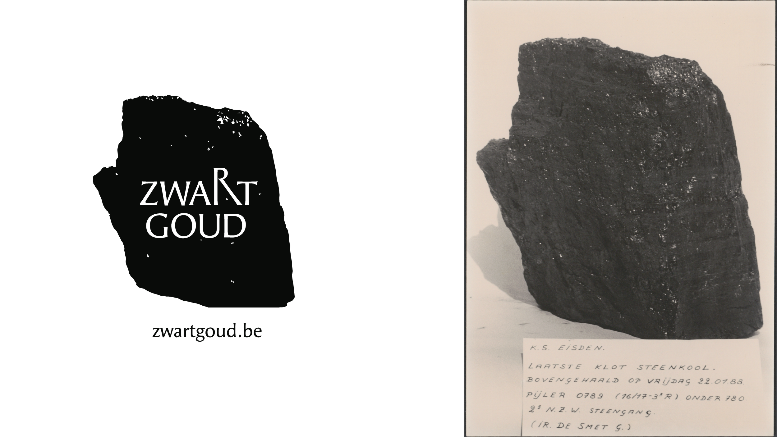
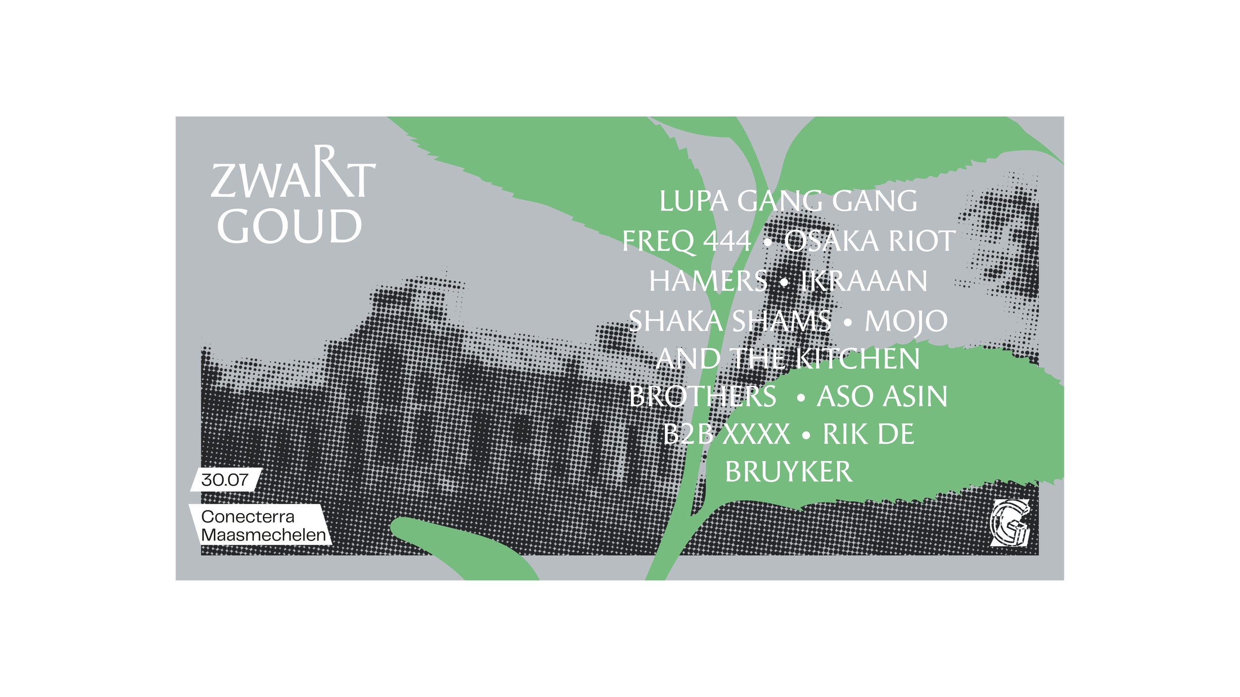
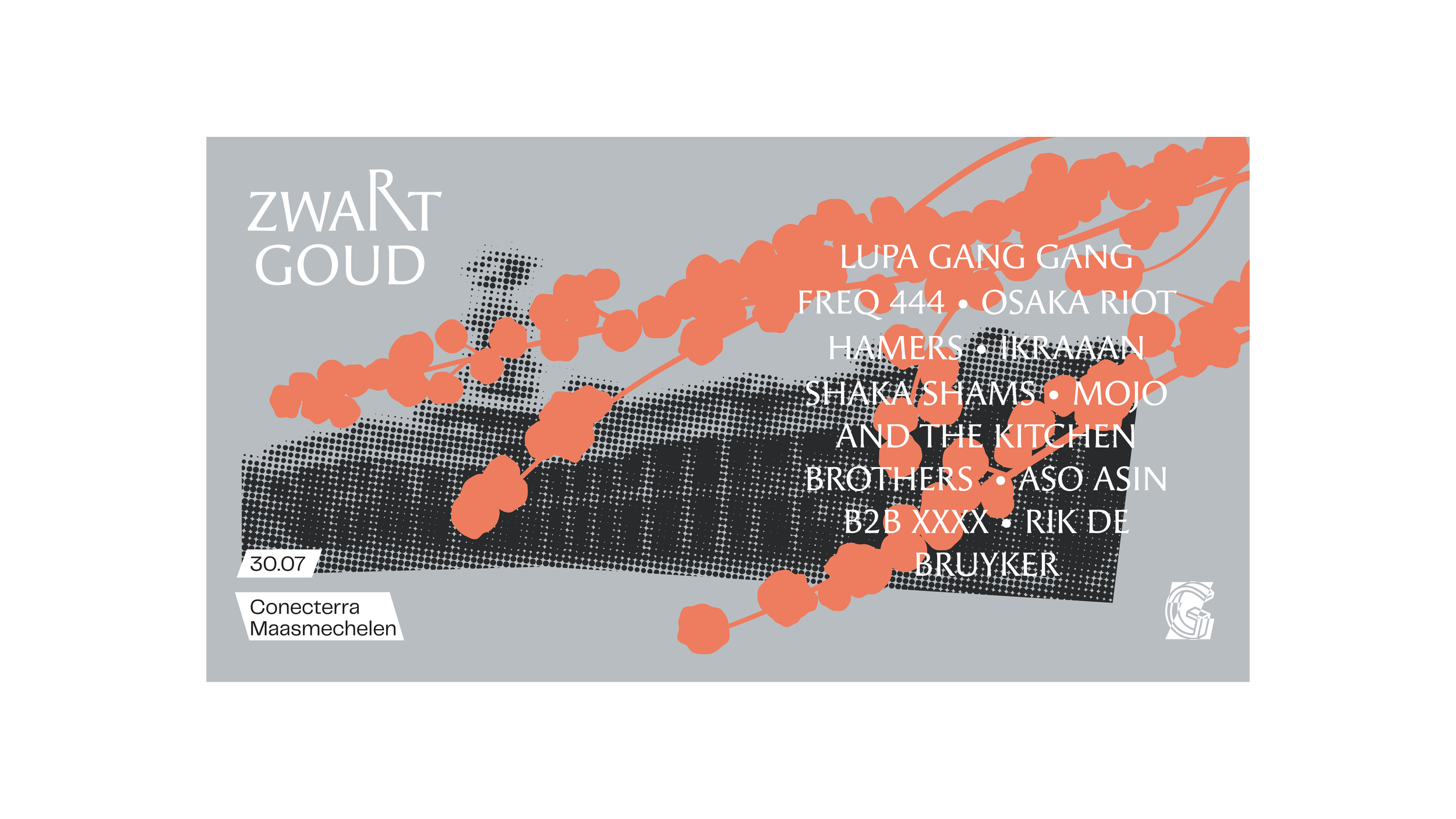
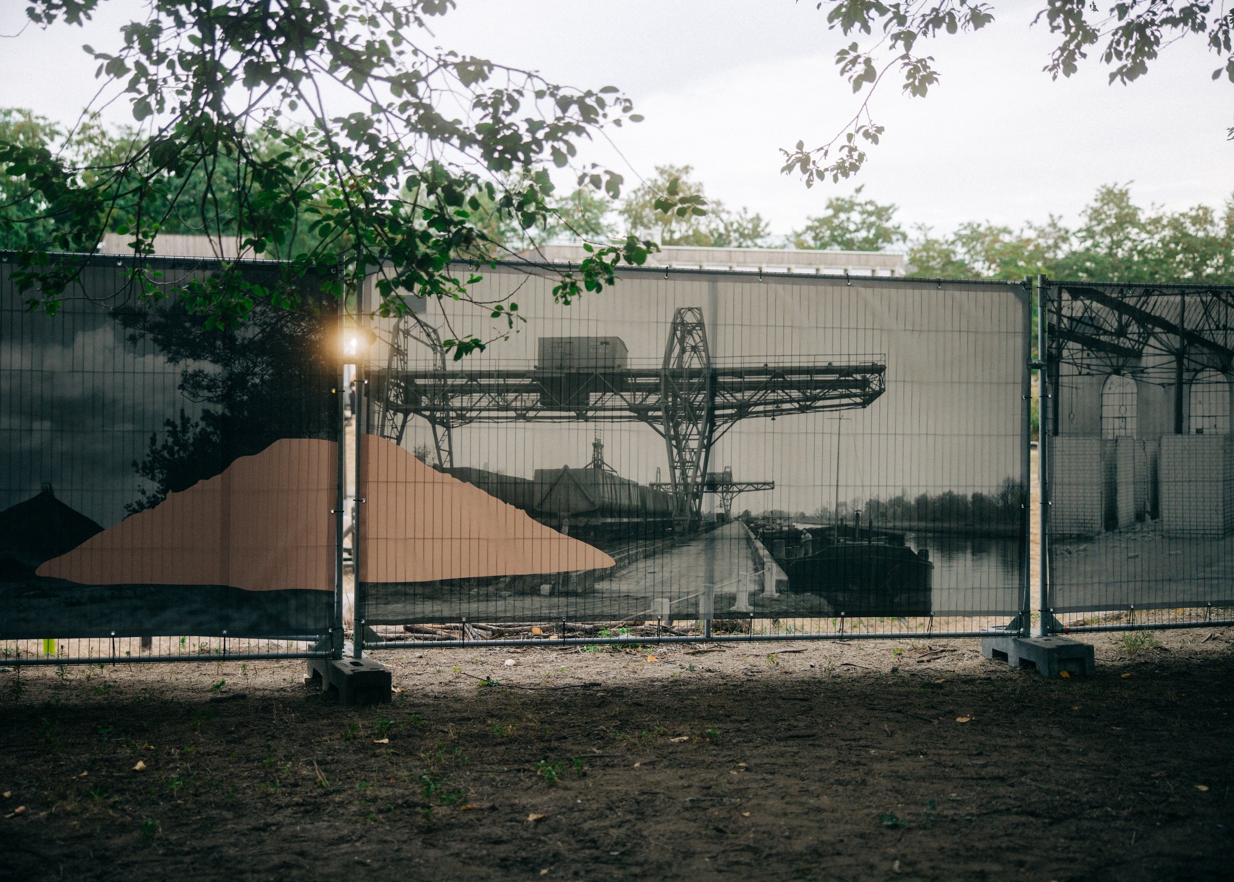
The three main pilars of the festival are: discovery, nature & ecology and local mining heritage. Over the years, they lost their focus a bit so they were keen to bring this back to the forefront.
That’s why we decided incorporate archival footage from the local heritage organization into the visuals. The mission was clear: the old ‘ZG’ monogram had to stay and a new corporate identity had to be designed around it.
Client: Zwart Goud
Photo: Annika Wallis & Tone Verswijve
Video: Bert Kamoen
Year: 2022
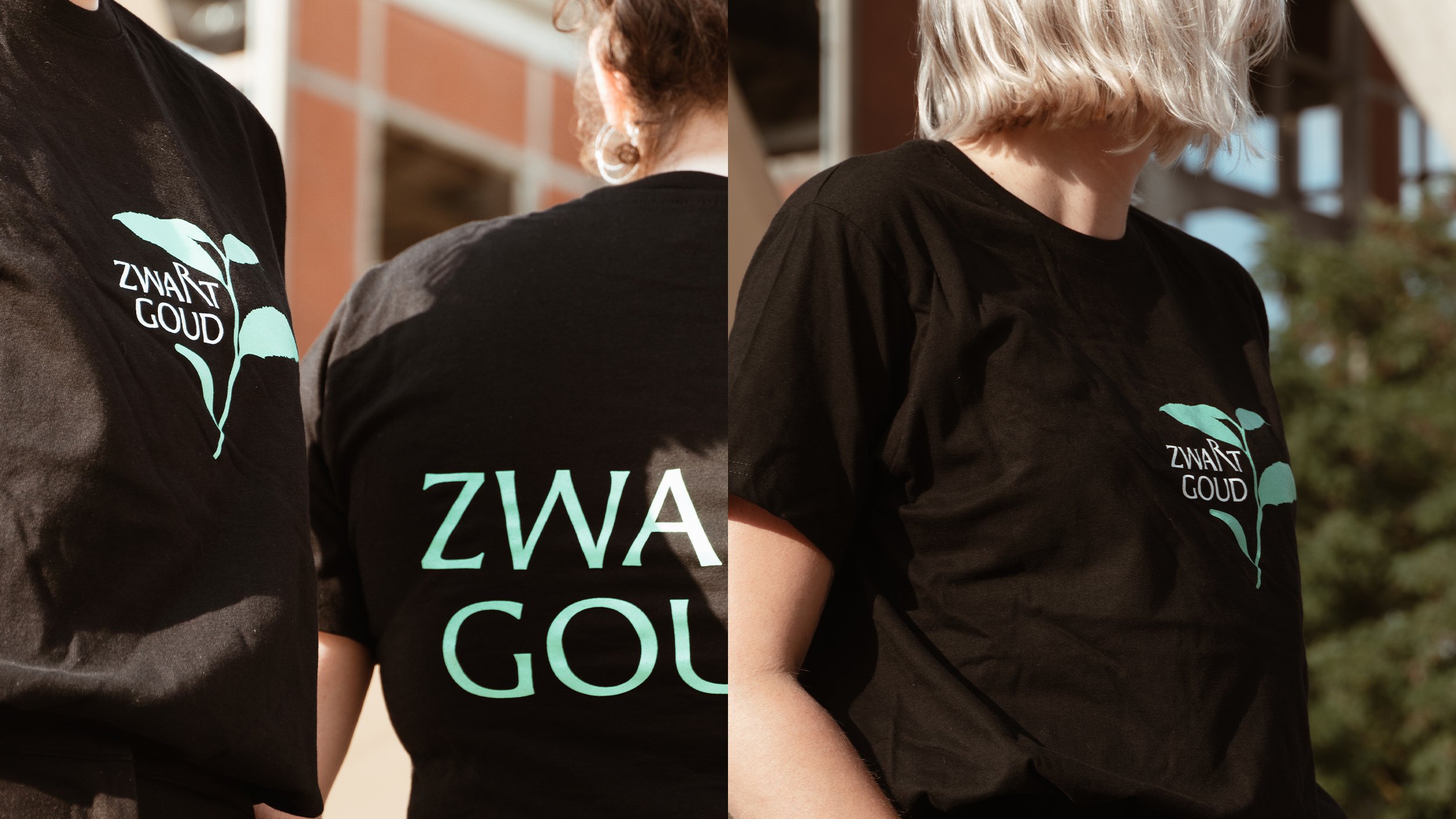
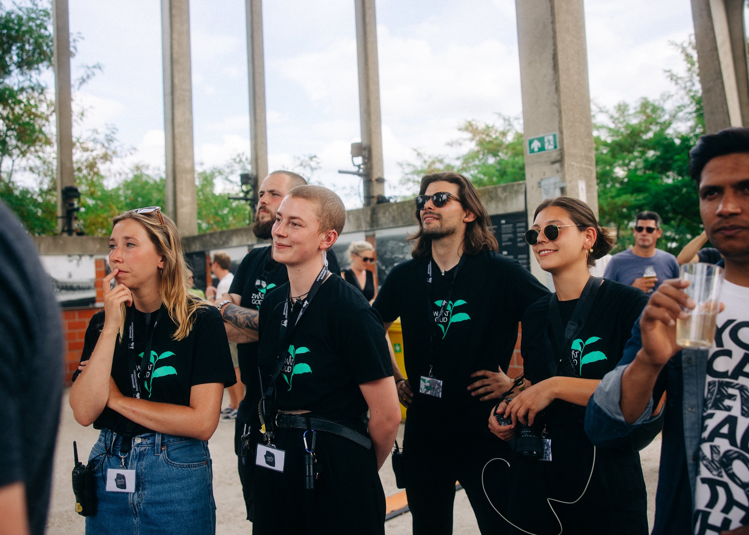
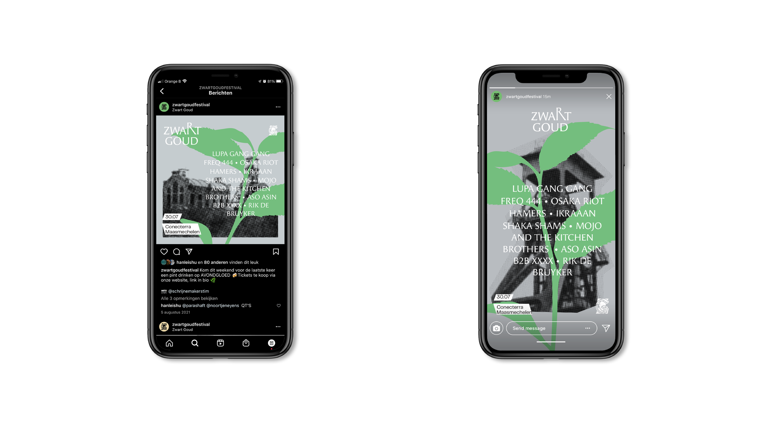
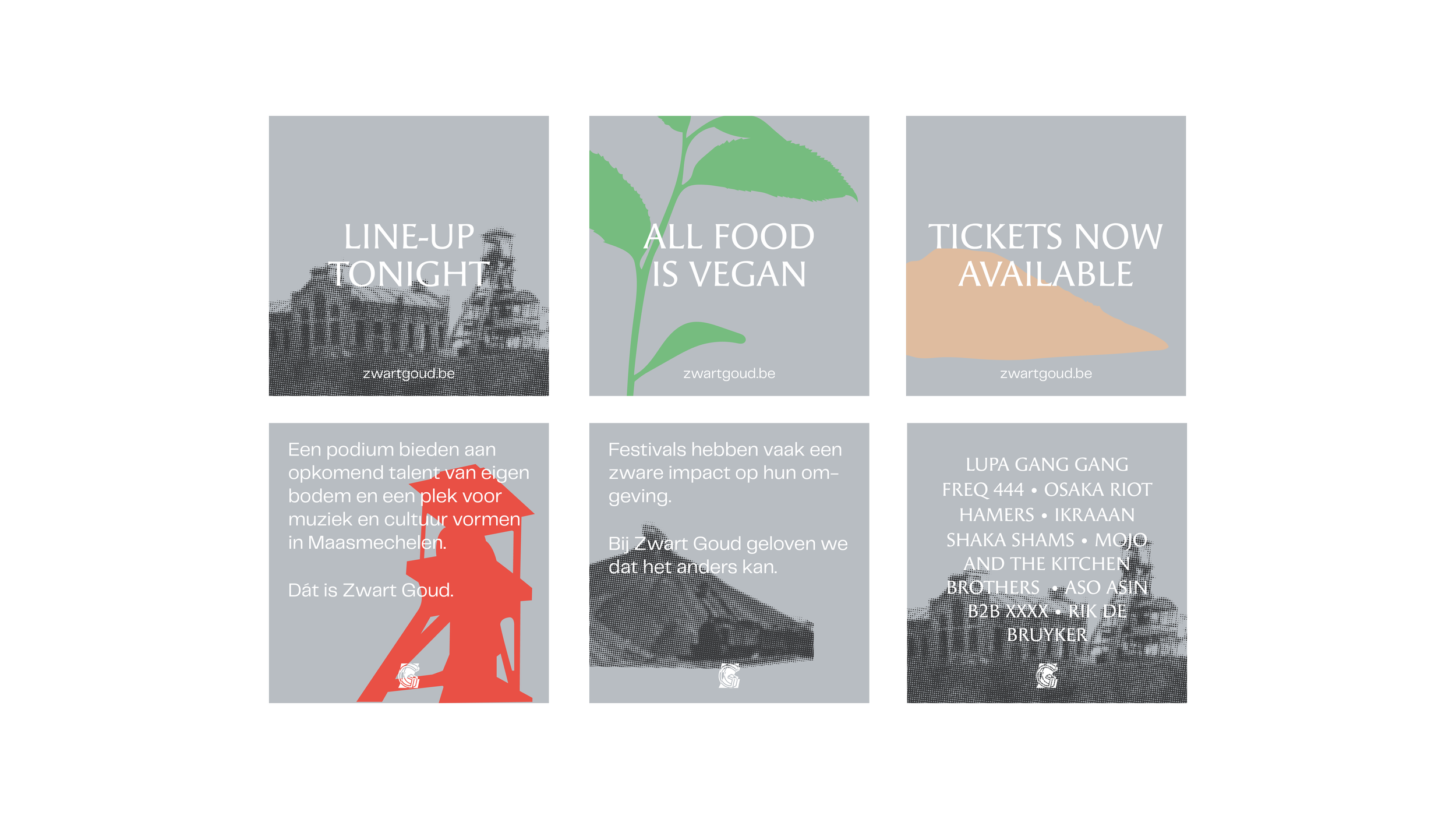
rebranding / logo design / brand identity / banners / art-direction website / print design / social media visuals / signalisation / merchandise / templates